
Luxury packaging needs clear identity. For cigars, certain visual symbols make buyers instantly say, “This is cigar culture.”
Tobacco leaves, wood grains, crests, rich colors, ribbons, and heritage typography are the strongest visual markers of cigar-exclusive aesthetics.
These symbols carry both tradition and recognition, forming the language of the industry.
Why do tobacco leaf motifs and natural wood grains instantly connect with cigar culture?

Cigars start with tobacco leaves. Packaging that reflects this origin feels authentic.
Tobacco leaf motifs and wood grains connect instantly with cigar culture by highlighting natural origin and craftsmanship.
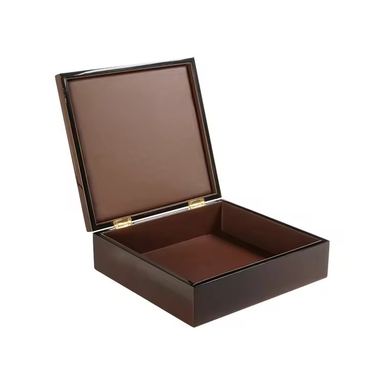
When I designed a box with subtle tobacco-leaf engraving on the lid, buyers called it “organic luxury.” It reminded them of plantations, tradition, and handcraft. Similarly, showing visible wood grains connects to nature and authenticity.
Key traits
- Leaf patterns symbolize source and purity.
- Wood grains signal artisanal, earthy quality.
- Both emphasize natural heritage.
| Symbol | Consumer Association |
|---|---|
| Tobacco leaf | Authentic origin |
| Natural wood | Handcrafted quality |
These cues are direct and universal, making them among the strongest identifiers of cigar aesthetics.
How can vintage crests, shields, or emblems signal heritage and authenticity?

Cigar culture has always leaned on heritage. Crests and emblems are its visual shorthand.
Vintage crests, shields, and emblems signal authenticity by linking packaging to aristocratic traditions and historical prestige.
I worked on a project that used a family crest embossed in gold. Collectors felt it elevated the brand’s story, even when they had no direct family connection. Symbols like shields or coats-of-arms make cigars feel like noble products with lineage.
Why it works
- Heritage = authority.
- Emblems = cultural memory.
- Vintage detailing = trust in tradition.
| Symbol | Consumer Effect |
|---|---|
| Crest | Legacy |
| Shield | Authority |
| Emblem | Authentic heritage |
These symbols make boxes feel less like packaging and more like cultural artifacts.
In what way do rich colors like deep brown, gold, and burgundy convey cigar tradition?

Color tells stories faster than words. For cigars, the palette is fixed in tradition.
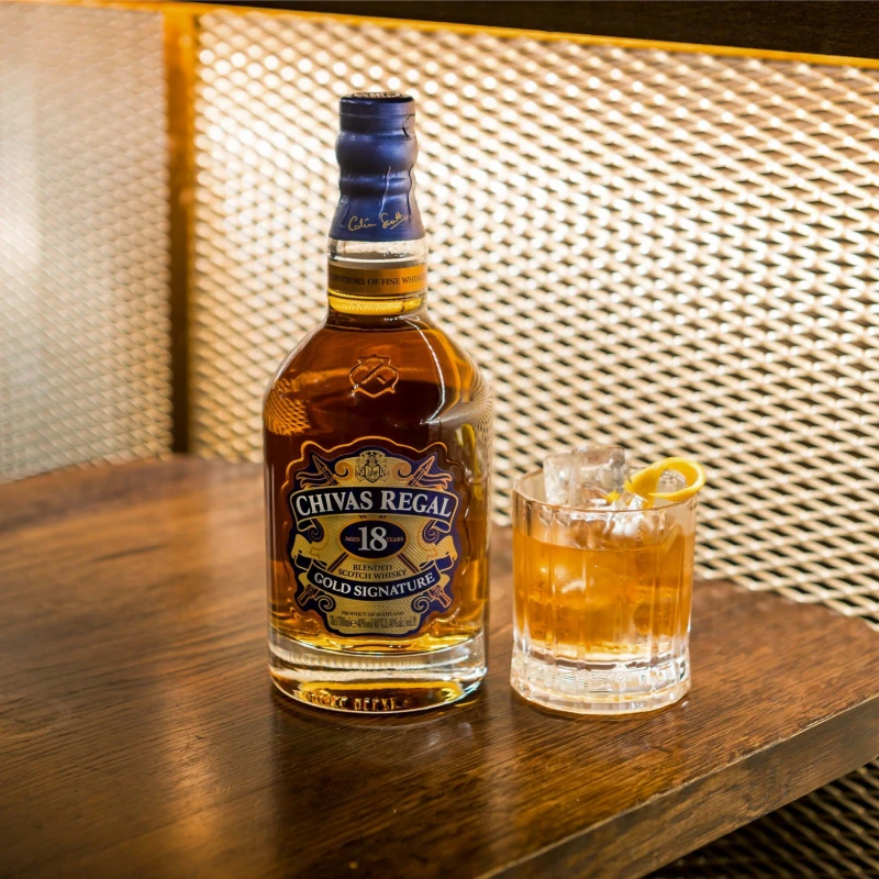
Deep brown, gold, and burgundy convey cigar tradition by reflecting tobacco, luxury, and ceremonial richness.
Brown matches tobacco leaves and wooden boxes. Gold adds prestige and opulence. Burgundy reflects richness, wine, and old-world celebration. When combined, these colors form the visual DNA of cigar packaging.
Traditional cigar palette
- Deep brown = earth, nature, authenticity.
- Gold = wealth, refinement, prestige.
- Burgundy = depth, richness, passion.
| Color | Symbolism |
|---|---|
| Brown | Tobacco + wood |
| Gold | Luxury |
| Burgundy | Tradition + richness |
These hues instantly signal “cigar-exclusive” because they match consumer expectations across cultures.
Why are ribbons, bands, and sealing labels strong identifiers of cigar packaging?
Few products use ribbons and seals the way cigars do. They are almost exclusive identifiers.
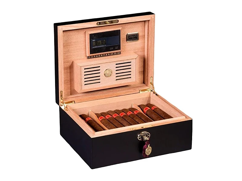
Ribbons, bands, and sealing labels are strong identifiers because they are unique traditions tied to cigar presentation and authenticity.
I recall designing a box where a satin ribbon lifted the first row of cigars. Customers said this single detail made the experience feel “ritualistic.” Sealing labels also build trust, since breaking the seal signals originality.
Functions beyond beauty
- Ribbons = ritual of presentation.
- Bands = identity and branding.
- Seals = authenticity guarantee.
| Symbol | Consumer Meaning |
|---|---|
| Ribbon | Luxury ritual |
| Cigar band | Personal branding |
| Seal label | Authenticity |
These cues are packaging elements unique to cigars, making them unmistakably part of the culture.
How do classic typography styles (serif fonts, ornate lettering) reinforce the cigar aesthetic?

Typography is voice. For cigars, the voice is almost always classic.
Serif fonts and ornate lettering reinforce cigar aesthetics by echoing history, tradition, and aristocratic refinement.
In one project, we tested sans-serif fonts. They looked modern but felt disconnected from cigar culture. When we returned to serif-based, engraved lettering, buyers immediately said, “This feels right.”
Why serif and ornate fonts work
- They recall old printing presses.
- They align with heritage and luxury.
- They add gravitas to brand names.
| Font Style | Perception |
|---|---|
| Serif | Heritage, stability |
| Ornate | Prestige, artistry |
| Sans-serif | Too modern, lacks cigar link |
Typography alone can make or break cigar-exclusive recognition.
Should symbolic elements like maps of the Caribbean or colonial-style ornaments be used to highlight origin identity?
Cigar culture is tied to geography—Cuba, Dominican Republic, Nicaragua. Symbols can highlight this, but must be used carefully.
Maps of the Caribbean or colonial-style ornaments can highlight origin identity, but they must be respectful and artistic to avoid cliché.
For instance, a subtle engraved map of Havana can enrich storytelling. But overusing colonial sails and exotic clichés risks looking like tourist souvenirs. The key is tasteful integration.
Good practices
- Use maps or geographic lines as background engravings.
- Commission authentic cultural motifs, not generic clip art.
- Pair origin references with premium finishes.
| Symbol Type | Risk | Success Factor |
|---|---|---|
| Maps | Overdone cliché | Subtle engraving |
| Ornaments | Decorative excess | Authentic restraint |
When origin cues are refined, they strengthen authenticity and deepen brand storytelling.
Conclusion
Cigar-exclusive packaging is built on symbols: tobacco leaves, wood grains, crests, rich colors, ribbons, and heritage typography. Together, these visual codes make cigar boxes instantly recognizable as cultural and luxury objects.
Brand Name: WoodoBox
Slogan: Custom Wooden Boxes, Crafted to Perfection
Website: www.woodobox.com
WhatsApp: +86 18359265311