Holiday editions give cigar brands a chance to create excitement, but careless festive design risks looking cheap. The challenge is to stay seasonal yet luxurious.
Brands can balance festivity with premium aesthetics by refining holiday colors, using subtle patterns, applying premium finishes, and ensuring brand identity remains clear.
Let’s explore how.
Why is it important to avoid making festive designs look too casual or mass-market?
Holiday packaging can quickly cross into novelty if handled poorly. That weakens luxury positioning.
Avoiding overly casual or mass-market visuals is key because premium cigars must look collectible and refined, not disposable.
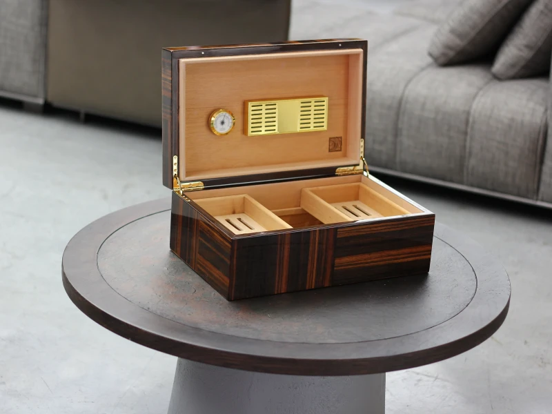
For cigars, the holiday design should feel like a limited treasure, not like supermarket décor. Subtlety preserves dignity and exclusivity.
Risks of mass-market design
| Pitfall | Negative Effect | Consumer Perception |
|---|---|---|
| Loud graphics | Looks cheap | Breaks premium image |
| Excessive color mix | Feels chaotic | Distracts from brand prestige |
| Plastic embellishment | Reduces authenticity | Seen as gimmicky |
I once saw a brand use cartoon-style snowmen on cigar boxes. Collectors dismissed them as “toys, not luxury.” Lesson: too casual kills exclusivity.
How can colors like red, gold, or green be refined to maintain elegance and luxury?
Colors are the core of holiday cues, but refinement makes them premium.
Red, gold, and green can maintain elegance when paired with deep tones, rich finishes, or metallic accents rather than flat, playful hues.
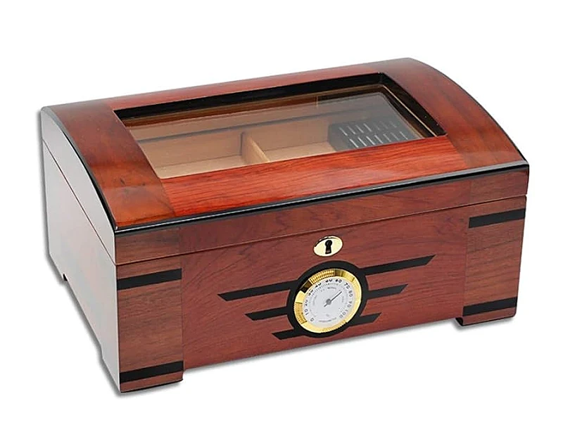
For example, crimson velvet red instead of bright cherry, antique gold instead of shiny foil, or forest green instead of neon. These shades signal sophistication.
Refined holiday palettes
| Color Choice | Luxury Treatment | Resulting Impression |
|---|---|---|
| Deep crimson red | Gloss lacquer or satin | Warm, premium festive feel |
| Antique gold | Hot stamping or embossing | Prestige and elegance |
| Forest green | Matte or wood grain accent | Natural, refined richness |
I once designed boxes with forest green satin lacquer and gold foil. Collectors said it felt like “Christmas with dignity.”
In what way can subtle patterns (snowflakes, ornaments, cultural motifs) enhance festivity without overwhelming the design?
Patterns add festivity, but they should not dominate.
Subtle holiday motifs enhance the seasonal mood when applied as accents—engraved, embossed, or tone-on-tone—rather than oversized prints.
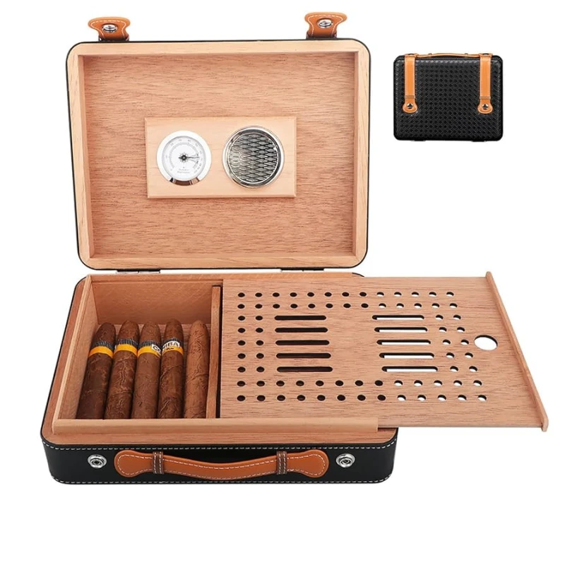
Snowflakes in blind embossing, ornaments as borders, or cultural motifs integrated into a crest keep designs celebratory but premium.
Subtle festive motifs
| Motif Example | Application Method | Effect on Luxury |
|---|---|---|
| Snowflakes | Embossed corner detail | Elegant seasonal touch |
| Ornament shapes | Gold inlay on borders | Festive without distraction |
| Cultural motifs | Laser-engraved background | Storytelling plus dignity |
One limited-edition line I helped design used tone-on-tone snowflakes. Collectors called it “festive, but refined enough to keep on display all year.”
Materials transform seasonal visuals from playful to prestigious.
Premium finishes like lacquer, embossing, and metallic foils elevate holiday packaging by aligning festivity with craftsmanship and luxury codes.
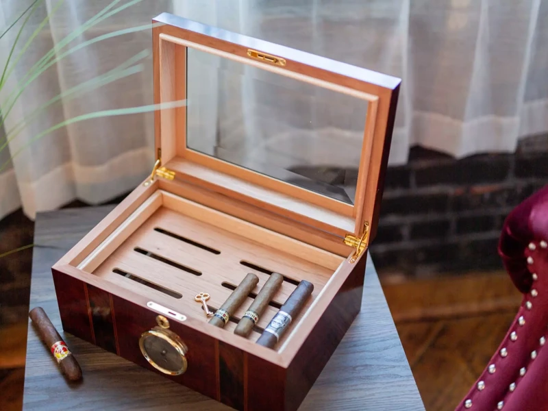
A simple red box may look ordinary, but red piano lacquer with gold hot stamping feels like heirloom décor. Material richness protects the brand’s premium image.
Premium holiday materials
| Material/Finish | Holiday Effect | Prestige Signal |
|---|---|---|
| Piano lacquer | Deep, glossy celebration | Heritage craftsmanship |
| Metallic stamping | Refined festive highlight | Wealth and nobility |
| Embossing/engraving | Tactile luxury detail | Artisanal authenticity |
I once supplied a batch of crimson lacquered boxes with gold embossed crests. Buyers called them “holiday jewelry for cigars.”
Why should the brand’s core visual identity remain visible beneath the festive layer?
Holiday editions should celebrate the season, but they must not erase brand DNA.
Keeping the core identity visible—logo, crest, or structure—ensures consumers still see the brand first, not just decoration.

When festive designs hide core branding, recognition is lost. Subtle seasonal overlays preserve both exclusivity and continuity.
Balancing festive & identity
| Core Identity | Festive Layer | Effect |
|---|---|---|
| Crest or emblem | Framed by gold snowflakes | Seasonal but recognizable |
| Signature silhouette | Holiday lacquer color | Festive twist, same DNA |
| Typography style | Seasonal emboss highlights | Continuity with variation |
I once saw a holiday box with no crest, only Christmas graphics. Buyers said, “It looks like any gift box.” Identity must lead.
How can limited-edition holiday boxes strengthen both brand exclusivity and emotional connection with consumers?
Seasonal boxes are not just packaging—they are keepsakes.
Holiday editions strengthen exclusivity by being time-bound and collectible, while also building emotional connections tied to festive memories.

Buyers often keep holiday boxes long after cigars are gone, using them as décor or storage. The box becomes part of their seasonal traditions.
Holiday limited edition impact
| Value Dimension | Effect on Brand | Consumer Emotion |
|---|---|---|
| Exclusivity | Limited run = rarity | Collectible prestige |
| Emotional connection | Linked to festive memory | Sentimental attachment |
| Display value | Seasonal keepsake | Pride of ownership |
A client once told me their holiday-edition boxes had higher resale than standard lines. The seasonal story added cultural and emotional weight.
Conclusion
Holiday cigar boxes succeed when they combine festive warmth with premium craftsmanship—refined colors, subtle patterns, rich materials, and clear brand identity—creating keepsakes that enhance both exclusivity and emotional value.
Brand Name: WoodoBox
Slogan: Custom Wooden Boxes, Crafted to Perfection
Website: www.woodobox.com
WhatsApp: +86 18359265311


