Minimalism is powerful when done well. But when done poorly, it feels like nothing at all.
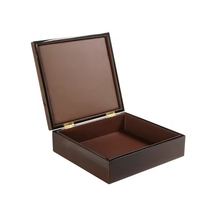
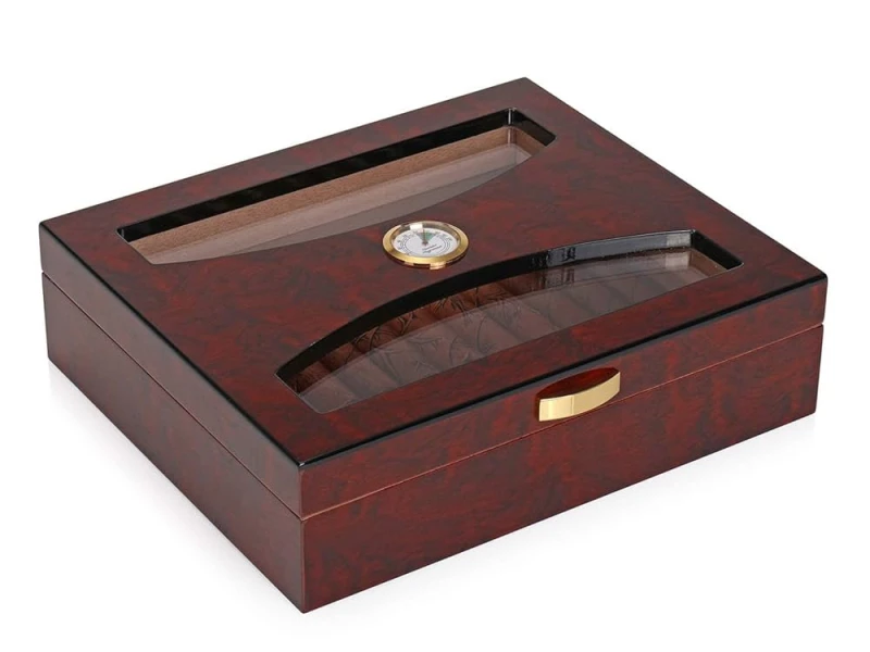
A cigar box can look “undesigned” if minimalism removes identity, texture, or proportion, leaving emptiness instead of refinement.
The secret is restraint with intention, not absence of design.
Why does removing too many visual cues risk losing a sense of brand identity?

Minimalism is not erasure. If all cues vanish, the brand disappears with them.
Removing too many visual cues risks losing brand identity, because buyers need at least one anchor to recognize and remember.
I once worked with a client who wanted an all-black matte box with no logo, no typography, no accents. It looked sleek in concept, but in practice it looked anonymous. Customers said it could have been from any brand.
Risks of over-removal
- Logo absence removes recognition.
- No accents erases character.
- Total simplicity creates forgettable design.
| Design Element | Without It… |
|---|---|
| Logo | No recognition |
| Typography | No voice |
| Accent detail | No character |
Minimalism works best when something stays consistent: a subtle crest, an engraved line, or an iconic proportion.
How can overly plain surfaces without texture or finish look unfinished rather than refined?
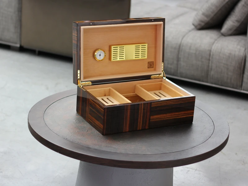
Flat surfaces can look cheap if they lack detail. Minimalism needs texture to feel alive.
Overly plain surfaces without texture or finish often look unfinished, giving the impression of cost-cutting rather than refinement.
For example, a plain MDF box with no veneer or lacquer feels raw, not elegant. But a matte walnut with subtle grain feels luxurious, even if the design is simple.
Why finishes matter
- They add tactile richness.
- They separate luxury from generic.
- They prove intention, not laziness.
| Surface Treatment | Consumer Perception |
|---|---|
| Raw plain wood | Incomplete, cheap |
| Matte lacquer | Understated luxury |
| Satin finish | Subtle refinement |
| Veneer grain | Natural elegance |
Minimalism does not mean empty. It means controlled simplicity, supported by craft.

Minimalist boxes depend on perfect proportion. Without it, they lose balance.
Lack of proportion control or structural detail weakens premium feel by making the box look ordinary instead of sculpted.
I often explain to clients that minimalism is like architecture. If lid thickness, edge radius, or hinge placement are careless, the box feels cheap even with fine materials. Precision is the invisible luxury.
Key proportion details
- Lid thickness vs body.
- Edge smoothness and radius.
- Balance between box size and cigar format.
| Structural Detail | Impact |
|---|---|
| Too thick lid | Feels clumsy |
| Uneven edges | Feels careless |
| Balanced ratio | Feels intentional |
Minimalism thrives on balance. Without proportion, it falls into mediocrity.
Why do generic fonts or absent typography make minimalism appear careless instead of intentional?
Typography is often the only voice in a minimalist design. If it fails, silence feels careless.
Generic fonts or absent typography make minimalism appear unplanned, because words are part of the visual identity.
For one brand, we tested plain Arial on a matte box. It looked like a budget prototype. But when we switched to a custom serif with embossed silver, the box felt refined. Same minimalism—different execution.
Typography choices in minimalism
- Use custom or brand-consistent fonts.
- Apply subtle techniques (emboss, foil, engraving).
- Keep words few, but meaningful.
| Typography Style | Consumer Perception |
|---|---|
| Generic font | Careless, cheap |
| No typography | Anonymous |
| Refined custom | Elegant, intentional |
Typography is design even when minimal. It makes the box whisper rather than vanish.
How can poor material choice turn “minimal” into “cheap” in consumer perception?

Minimalism exposes everything. Without decoration, materials are naked.
Poor material choice makes minimalism look cheap because there are no distractions to hide flaws.
If the veneer is thin, the lacquer uneven, or the hinges weak, buyers notice instantly. Minimalist design demands top-tier materials, because every surface becomes the focus.
Material pitfalls
- Thin veneer that peels.
- Soft MDF with no reinforcement.
- Low-quality hinges that creak.
Material strengths
- Solid walnut or mahogany.
- Smooth lacquer or satin finish.
- Brass or hidden hinges.
| Material Quality | Minimalism Effect |
|---|---|
| Poor | Exposed flaws |
| Standard | Feels basic |
| Premium | Feels sculpted |
Minimalism without good materials is not minimalism. It is just emptiness.

Minimalism shines through subtlety. The smallest detail can carry the whole design.
Subtle touches like visible grain, embossing, or hidden structural features keep minimalism alive while preserving elegance.
I once designed a box that looked plain at first glance. But close inspection revealed a debossed crest inside the lid and carefully matched veneer grain. Customers called it “quiet luxury.”
Subtle details that add depth
- Natural wood grain matched across panels.
- Embossed or engraved logo in discreet placement.
- Hidden magnetic closures for seamless form.
- Interior contrasts like velvet lining.
| Subtle Touch | Effect |
|---|---|
| Grain matching | Natural artistry |
| Embossed crest | Hidden luxury |
| Magnetic lock | Precision |
| Interior detail | Secret richness |
Minimalism is never about emptiness. It is about giving space for small details to shine.
Conclusion
Minimalist cigar boxes fail when they erase identity or quality. They succeed when restraint highlights proportion, materials, and subtle artistry.
Brand Name: WoodoBox
Slogan: Custom Wooden Boxes, Crafted to Perfection
Website: www.woodobox.com
WhatsApp: +86 18359265311


