Cigar flavors can be complex, but packaging often sets expectations before the first puff. Exterior color plays a crucial role in this communication.
Yes, exterior color can reflect cigar strength. When used carefully, it helps consumers connect with intensity levels while supporting brand storytelling.
Let’s break down how color works in this context.
Why does color psychology help consumers intuitively connect with cigar intensity?
Colors carry universal meanings. Even without text, consumers instinctively interpret them.
Color psychology supports intuitive connections because lighter, medium, and darker shades naturally align with perceptions of strength, richness, and depth.

This subconscious association allows packaging to guide expectations without over-explaining. In luxury markets, such intuitive cues feel sophisticated.
Color psychology cues
| Color Tone | Psychological Meaning | Consumer Perception |
|---|---|---|
| Light tones | Softness, clarity | Mild, approachable |
| Medium tones | Balance, warmth | Moderate strength |
| Dark tones | Depth, seriousness | Strong, powerful |
I once worked with a brand that introduced a lighter cedar box for its mild line. Buyers said, “I knew it would be smooth before tasting.” Color set the tone.
How can lighter tones (beige, cream, soft wood) suggest a mild and smooth smoke?
Gentle colors immediately communicate softness.
Beige, cream, and natural cedar tones suggest mildness by evoking purity, airiness, and smoothness.
These shades create approachability and comfort. They feel less intimidating for new smokers and emphasize refinement over intensity.
Mild cigar tones
| Light Shade | Visual Effect | Consumer Expectation |
|---|---|---|
| Beige matte lacquer | Warm, soft personality | Smooth and gentle smoke |
| Cream satin finish | Clean, pure impression | Subtle flavor experience |
| Natural cedar grain | Honest, organic touch | Authentic, mild tradition |
One client released cream-lacquer boxes for their Connecticut blends. Customers said the look “felt soft, like the smoke itself.”
In what way do medium shades (walnut, burgundy) align with balanced flavor profiles?
Middle tones visually balance light and dark, just as medium cigars balance flavor.
Walnut browns, burgundy reds, or golden oaks align with balanced cigars because they suggest harmony and richness without heaviness.
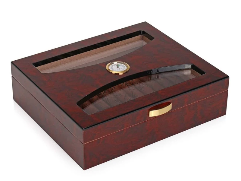
These colors appeal to both casual and experienced smokers. They feel sophisticated but not intimidating.
Medium cigar tones
| Medium Shade | Symbolic Effect | Consumer Perception |
|---|---|---|
| Walnut veneer | Natural balance | Smooth but complex profile |
| Burgundy lacquer | Warmth and refinement | Elegant medium body |
| Golden oak | Classic warmth | Accessible but premium |
I once developed walnut-finished boxes for a medium-bodied blend. Collectors said the visuals “matched the balance inside.”
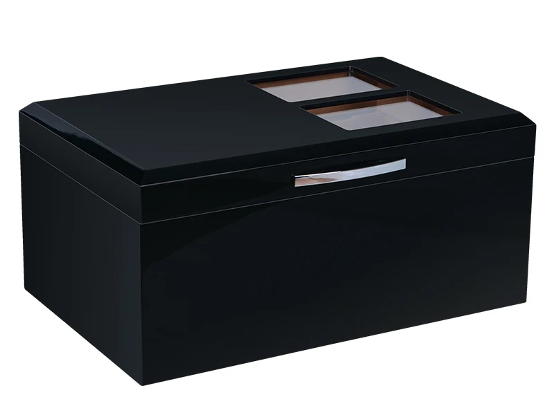
Why do dark tones (ebony, deep mahogany, black) naturally symbolize full-bodied strength?
Darkness conveys weight and intensity. For cigars, this aligns perfectly with stronger blends.
Ebony, deep mahogany, and black lacquer symbolize full-bodied strength by suggesting power, richness, and authority.

These tones attract seasoned smokers who seek bold flavors. They signal seriousness and prestige, elevating the experience.
Dark cigar tones
| Dark Shade | Symbolic Meaning | Consumer Expectation |
|---|---|---|
| Ebony lacquer | Authority and strength | Powerful, bold cigar |
| Deep mahogany | Heritage and richness | Strong, layered complexity |
| Matte black finish | Modern intensity | Elite, full-bodied impact |
One brand I worked with introduced matte black boxes for its strongest line. Enthusiasts praised them as “a warning of the boldness inside.”
How can a color-coded system improve consumer guidance without oversimplifying brand image?
Color systems make choices easier, but they must avoid reducing cigars to “traffic lights.”
A thoughtful color-coded system improves guidance by helping buyers navigate intensity levels while preserving sophistication.

Subtle gradations—light, medium, dark—can be tied to blends, but executed with premium finishes to prevent oversimplification.
Color system balance
| Approach | Consumer Benefit | Brand Safeguard |
|---|---|---|
| Light/medium/dark | Quick recognition | Luxury materials prevent cheapness |
| Finish variety | Adds sophistication | Each line feels collectible |
| Subtle accents | Keeps elegance | Avoids “color coding gimmick” |
I once implemented a cedar–walnut–ebony system for a client. Buyers said it “felt intuitive but still premium.”
Should brands use color as the main indicator, or combine it with other design cues like texture and typography?
Color alone may not be enough. Combining cues deepens storytelling.
Brands should pair color with textures, typography, or symbols to reinforce intensity while keeping identity strong.

For example, lighter cigars may use satin textures, medium ones embossed typography, and stronger ones bold metallic crests. This layering prevents color from oversimplifying flavor complexity.
Combined cues for strength
| Indicator | Role in Design | Strength Signal |
|---|---|---|
| Color palette | Primary intuitive cue | Light/medium/dark alignment |
| Texture finish | Reinforces depth | Satin vs. gloss vs. matte |
| Typography weight | Visual emphasis | Light elegance vs. bold power |
I once helped a brand combine matte black lacquer with heavy embossed serif type for a full-bodied blend. Customers said the pairing “felt powerful even before opening.”
Conclusion
Cigar box color can reflect strength by aligning lighter, medium, and darker tones with mild, balanced, and full-bodied blends. When combined with texture and typography, color becomes a refined guide rather than a gimmick.
Brand Name: WoodoBox
Slogan: Custom Wooden Boxes, Crafted to Perfection
Website: www.woodobox.com
WhatsApp: +86 18359265311