Many buyers get their first impression of a cigar not from taste, but from packaging. If colors fail to align with flavor, confusion follows.
The color of a cigar box should reflect the flavor profile, because color sets expectations, creates harmony, and strengthens brand storytelling.
When brands align design with flavor, customers connect faster and build stronger trust. Let’s look at how this works.
How can color psychology influence the smoker’s first impression of cigar flavor?
Without the right color, even premium cigars risk being misunderstood. Customers may expect one flavor but experience another, creating disappointment.
Color psychology shapes first impressions, setting a mental expectation of whether a cigar will be bold, smooth, rich, or mild.

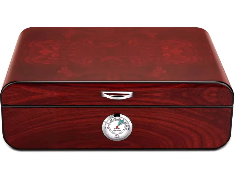
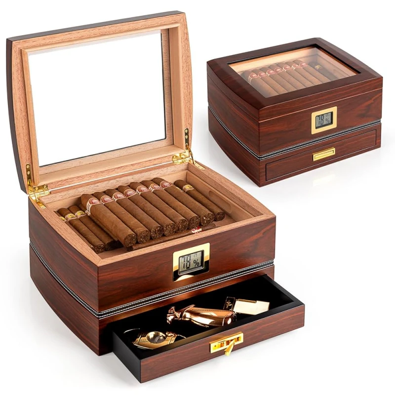
Color works as a silent language. Dark tones often suggest richness or intensity. Warm reds and browns create a sense of warmth and spice. Soft creams and whites feel mild and smooth. These cues give the smoker an idea of the taste before lighting up.
Examples of color-flavor connections
| Color Tone | Flavor Impression | Brand Impact |
|---|---|---|
| Deep brown | Full-bodied, rich, earthy | Strength and heritage |
| Gold or bronze | Warm, spicy, elegant | Refined luxury |
| Cream or ivory | Smooth, mild, creamy | Approachable sophistication |
| Black gloss | Bold, powerful, prestige | Premium authority |
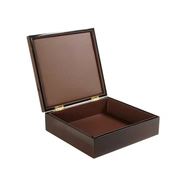
I remember working with a boutique brand that shifted from plain wood to rich burgundy lacquer. Customers later said the cigars “tasted stronger,” even though the blend had not changed. This shows how color alone can prime perception.
Why do earthy tones often pair with strong, full-bodied cigars?
If a strong cigar came in a light pastel box, buyers might misjudge it as mild. That mismatch reduces satisfaction and loyalty.
Earthy tones pair with full-bodied cigars because they mirror the natural, robust, and grounded qualities of the flavor.
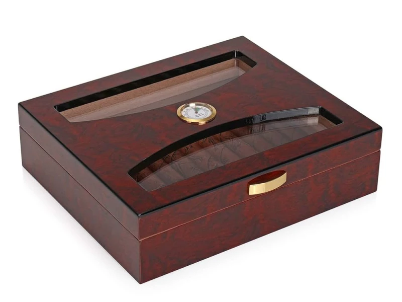
Colors like deep brown, mahogany, and terracotta feel natural and solid. They remind smokers of soil, tobacco leaves, and heritage farms. When matched with strong blends, these tones make the flavor feel more authentic and consistent.
Symbolism of earthy tones
| Earthy Tone | Flavor Message | Effect on Smoker Experience |
|---|---|---|
| Mahogany | Deep, robust, traditional | Confidence in intensity |
| Dark walnut | Powerful, aged, rich | Prestige and heritage |
| Terracotta | Rustic, grounded, authentic | Connection to the land |
I once helped design a humidor line for Nicaraguan cigars. We used a matte mahogany finish. Customers later described the cigars as “earthy, strong, and honest.” The packaging color reinforced what the taste already promised.
How does using lighter or softer colors communicate smooth or creamy flavor notes?
A heavy dark tone on a box for a mild cigar could mislead smokers. They might expect intensity but get smoothness, leaving them disappointed.
Lighter or softer colors communicate smoothness, creaminess, and balance, helping customers quickly connect flavor with experience.
Pastel or neutral tones create calmness. White, beige, or light wood grains feel clean and delicate. They reflect creamy, balanced flavors and appeal to smokers who prefer mild profiles. This makes the experience more predictable and enjoyable.
Common light-tone associations
| Color Tone | Flavor Impression | Emotional Effect |
|---|---|---|
| Ivory white | Creamy, smooth, refined | Calm, sophisticated |
| Soft beige | Balanced, mild, natural | Gentle, approachable |
| Pale gold | Sweet, light, elegant | Prestige with delicacy |
One client in Europe asked me to design a box for a creamy Connecticut blend. We chose a satin ivory finish with gold typography. Buyers said the box “looked as smooth as it tasted.” The design communicated flavor instantly.
In what way can mismatched packaging colors create confusion or weaken brand image?
If flavor and color do not match, buyers feel misled. Over time, this weakens trust and damages the brand.
Mismatched packaging colors confuse customers, reduce satisfaction, and weaken the overall brand image.

Imagine a strong cigar in a white box. Customers expect smoothness, but get strength instead. Or a mild cigar in a glossy black box—it feels intimidating rather than inviting. These mismatches create cognitive dissonance, leading to disappointment.
Consequences of mismatched design
| Scenario | Customer Expectation | Actual Experience | Result |
|---|---|---|---|
| White box, strong cigar | Smooth and creamy | Bold and intense | Confusion and dissatisfaction |
| Black box, mild cigar | Strong and rich | Gentle and mild | Perception of weakness |
| Earth-tone box, mild cigar | Robust and heavy | Soft and smooth | Broken trust |
I once saw a luxury brand release a light-bodied cigar in a piano black box. Customers thought it was too weak for its appearance. That mismatch hurt sales. Design and flavor must speak the same language.
How do luxury cigar brands use color harmony to tell a complete flavor story?
Luxury brands cannot afford mixed signals. They rely on harmony between flavor, design, and brand promise.
Luxury cigar brands use color harmony to link flavor with packaging, creating a complete sensory and storytelling experience.
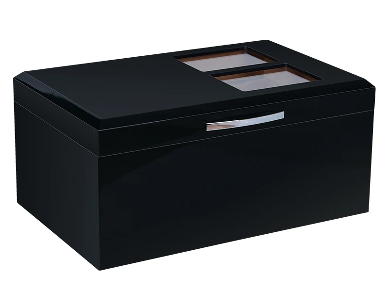
When box color, typography, and emblem all align with flavor, the brand story feels complete. For example, a bold Maduro cigar might come in a black lacquer box with gold foil, echoing both strength and elegance. A creamy blend may arrive in an ivory box with subtle embossing.
Examples of color harmony storytelling
| Flavor Profile | Box Color Design | Brand Story Impact |
|---|---|---|
| Full-bodied Maduro | Black gloss + gold emblem | Prestige, intensity, luxury |
| Mild Connecticut | Ivory matte + gold script | Smooth, creamy, refined |
| Spicy Habano | Deep red + bronze tones | Warmth, boldness, tradition |
I once worked with a Cuban-inspired brand that released three blends. Each had a distinct color reflecting its flavor. Collectors praised it, saying the boxes made the cigars “taste like they looked.” Harmony created a stronger identity.
Should cultural preferences also shape the link between cigar flavor and box color?
Color meanings vary worldwide. Ignoring cultural preferences risks sending the wrong message in different markets.
Cultural preferences should shape how box colors align with flavor, ensuring the design resonates globally with diverse cigar buyers.
For example, black in Western markets often means luxury and strength. In some Asian markets, white can symbolize purity but may also carry associations with mourning. Gold, however, is universally linked to prestige. Brands must consider local culture when pairing colors with flavors.
Cultural color meanings in cigar packaging
| Color | Western Meaning | Asian Meaning |
|---|---|---|
| Black | Luxury, power, authority | Strength, but sometimes death |
| White | Smoothness, purity | Purity, but also mourning |
| Red | Passion, boldness | Luck, prosperity |
| Gold | Prestige, wealth, elegance | Prosperity, high status |
I worked with a client exporting to China. We adjusted his Connecticut blend packaging from ivory white to pale gold. Sales improved immediately, as the gold tone matched both smooth flavor and cultural preference for prosperity.
Conclusion
Cigar box colors must align with flavor, psychology, and culture, so customers experience harmony between design and taste.
Brand Name: WoodoBox
Slogan: Custom Wooden Boxes, Crafted to Perfection
Website: www.woodobox.com
WhatsApp: +86 18359265311