A cigar may be universal, but packaging perception changes across cultures. Ignoring these differences risks losing resonance with target buyers.
Yes, cigar box design should consider cultural adaptation. Different regions value ornate, minimal, or symbolic aesthetics, and aligning design enhances appeal without losing identity.
Let’s examine how this works in key markets.
Why is cultural adaptation important in luxury packaging design for cigars?
A box that looks elegant in one country may look outdated or confusing in another.
Cultural adaptation is crucial because it aligns luxury cues with local expectations, ensuring packaging feels premium and relevant everywhere.

Luxury is not defined the same way across cultures. In some regions, bold and ornate means prestige. In others, restraint and minimalism feel more luxurious. Adapting design ensures customers see the brand as aligned with their values.
Importance of cultural adaptation
| Market Factor | Why It Matters | Effect on Buyer Perception |
|---|---|---|
| Cultural taste | Defines what feels premium | Stronger local relevance |
| Symbolic meaning | Shapes emotional response | Deeper cultural connection |
| Buying behavior | Influences brand loyalty | Better long-term success |
I once worked with a brand that launched ornate boxes in Northern Europe. Sales lagged until they switched to cleaner designs. Adaptation turned the project around.
How do Middle Eastern consumers perceive ornate patterns, gold, and rich colors?
In Middle Eastern culture, richness in decoration is often seen as a sign of prestige and power.
Middle Eastern consumers perceive ornate patterns, gold accents, and deep colors as strong signals of luxury and exclusivity.
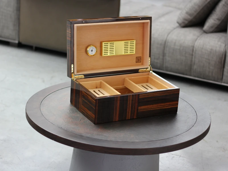
Geometric motifs, arabesque borders, and heavy gold foil echo regional art and luxury products. Deep tones like burgundy, emerald, and royal blue carry cultural weight.
Middle Eastern preferences
| Design Element | Cultural Effect | Consumer Perception |
|---|---|---|
| Ornate patterns | Links to Islamic art | Heritage and sophistication |
| Gold foil and accents | Prestige and opulence | Exclusive, royal identity |
| Deep colors | Strength and nobility | High-status luxury |
I once produced a burgundy high-gloss box with heavy gold foil for a Gulf client. He said, “This feels like luxury in our culture.” Sales confirmed the design matched local expectations.
Why do European and American markets often prefer classic, minimalist elegance?
In the West, especially in luxury packaging, less often means more.
European and American buyers often prefer minimalist elegance because it conveys timeless sophistication and trust in tradition.
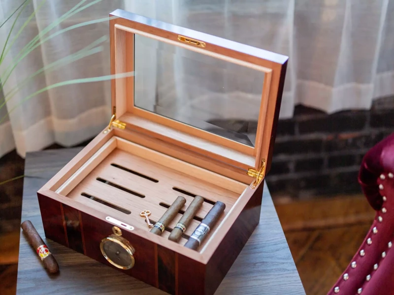
Boxes with clean lines, subtle wood grain, and restrained use of logos resonate better. Customers link minimalism to authenticity and premium lifestyle.
Western preferences
| Design Element | Cultural Effect | Consumer Perception |
|---|---|---|
| Minimalist layout | Modern sophistication | Prestige through restraint |
| Matte or satin finish | Understated elegance | Quiet confidence |
| Classic typography | Heritage and trust | Authentic legacy |
I once helped a European brand remove ornate frames and keep only an embossed crest. Customers described it as “serious, authentic, and elegant.”
In what way do Asian buyers respond to symbolic motifs and refined craftsmanship?
In Asian markets, symbolism and fine craftsmanship carry deep meaning.
Asian buyers respond positively to symbolic motifs and refined finishing, because these reflect cultural values of meaning, harmony, and respect.
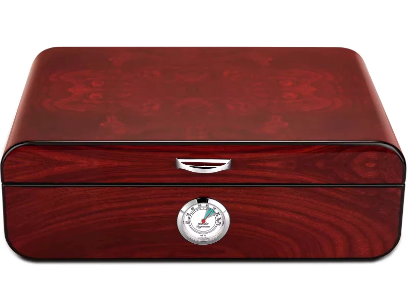
Colors like red and gold signal prosperity in China. In Japan, refined craftsmanship and harmony in design feel more prestigious than decoration alone. Across Asia, symbols of nature, dragons, or cultural motifs resonate strongly.
Asian preferences
| Design Cue | Cultural Effect | Buyer Response |
|---|---|---|
| Red and gold tones | Prosperity and celebration | Prestige and luck |
| Nature motifs | Harmony and respect | Emotional connection |
| Refined craftsmanship | Patience and perfection | High collectible value |
I once worked on a limited series for the Chinese market with subtle dragon embossing and gold foil. Collectors praised it as “cultural yet luxurious.”
How can a brand adapt culturally without losing its core identity?
Adapting does not mean abandoning. Core identity must remain consistent across all markets.
Brands can adapt culturally by keeping central symbols intact while adjusting finishes, motifs, and colors to match local expectations.
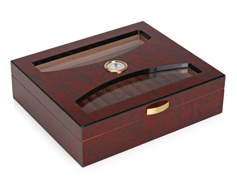
For example, a crest logo may remain, but the finish changes—matte walnut for Europe, gold foil on burgundy for the Middle East, or red lacquer for Asia. The story stays the same; the expression shifts.
Adaptation strategy
| Identity Element | Constant Feature | Variable Adaptation |
|---|---|---|
| Logo or crest | Unchanged across markets | Size, placement |
| Brand typography | Same family style | Color or finish variation |
| Core shape/structure | Recognizable consistency | Surface treatment differences |
I once designed for a brand selling in both the U.S. and Middle East. The box shape and logo stayed, but surface details varied. Customers in both regions recognized the brand instantly.
Should brands create region-specific editions, or maintain one global aesthetic with subtle cultural touches?
This is a strategic decision. Both approaches can work.
Region-specific editions create exclusivity, while global aesthetics with subtle touches maintain unity. The choice depends on market size and brand goals.
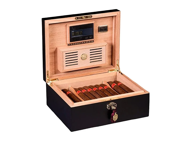
For strong markets like the Middle East or Asia, exclusive editions may justify cost. For global consistency, subtle adaptations (like color or finish) are enough.
Strategy comparison
| Approach | Advantage | Risk |
|---|---|---|
| Region-specific | Strong cultural resonance | Higher cost, complex logistics |
| Global with touches | Unified identity | May feel less localized |
I once guided a brand to release a limited Middle East edition with ornate gold, while keeping a global matte wood line. Both sold well, and customers appreciated the tailored approach.
Conclusion
Cigar box design should adapt culturally to align with local expectations while keeping brand identity consistent, balancing tradition, luxury, and relevance.
Brand Name: WoodoBox
Slogan: Custom Wooden Boxes, Crafted to Perfection
Website: www.woodobox.com
WhatsApp: +86 18359265311


