Co-branding can multiply prestige but also risks creating visual chaos. If two design languages fight each other, the packaging loses authority.
Cigar boxes for collaborations should clarify brand hierarchy, use shared visual elements, balance logos, and apply storytelling to unify both identities into one collectible edition.
Let’s see how this balance can be achieved.
Why is it important to clarify which brand plays the leading role in the collaboration?
When two brands meet, consumers must understand the relationship. Confusion weakens recognition.
Clarifying the lead brand is critical because it guides design hierarchy, ensuring one identity anchors the collaboration while the other plays a complementary role.
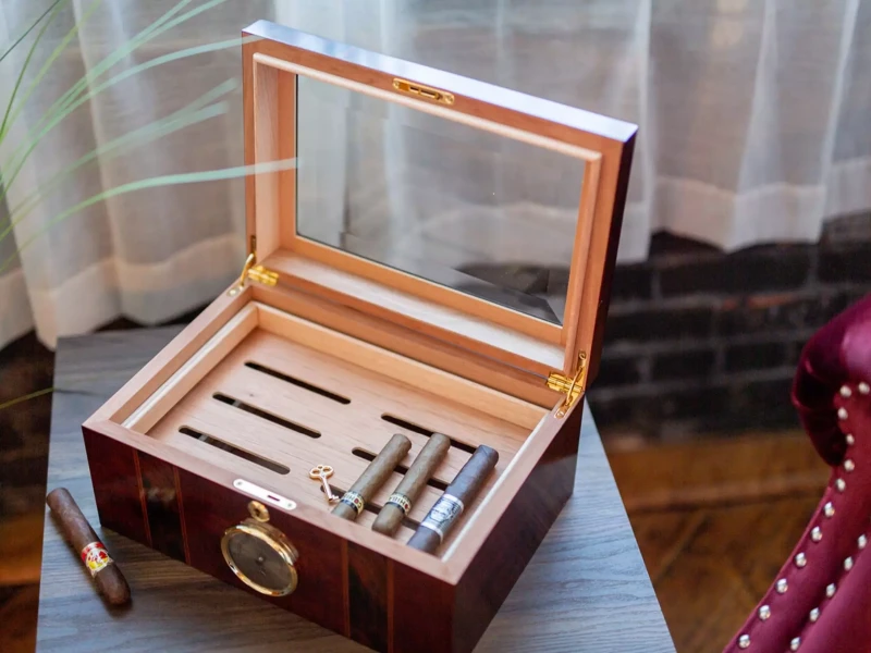
This hierarchy can be communicated by logo size, placement, or narrative positioning. Without clarity, packaging risks feeling like two competing advertisements.
Brand role hierarchy
| Collaboration Type | Visual Priority | Consumer Impact |
|---|---|---|
| Primary + partner | Lead brand dominates | Clear ownership |
| Equal partnership | Balanced treatment | Shared prestige |
| Guest collaboration | Subtle secondary branding | Exclusivity without dilution |
I once designed a Cuban-Dominican co-branded edition. We made the heritage Cuban brand lead, with the partner logo smaller on the side. Consumers described it as “respectful and clear.”
Color and material act as neutral meeting points when brands differ.
Shared palettes and materials unify design by creating a common language that prevents clashes while still allowing distinction.
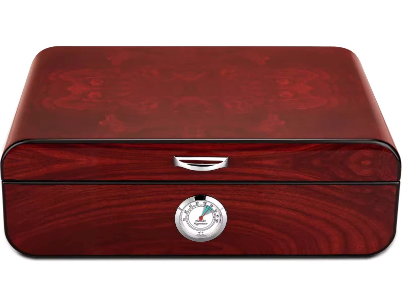
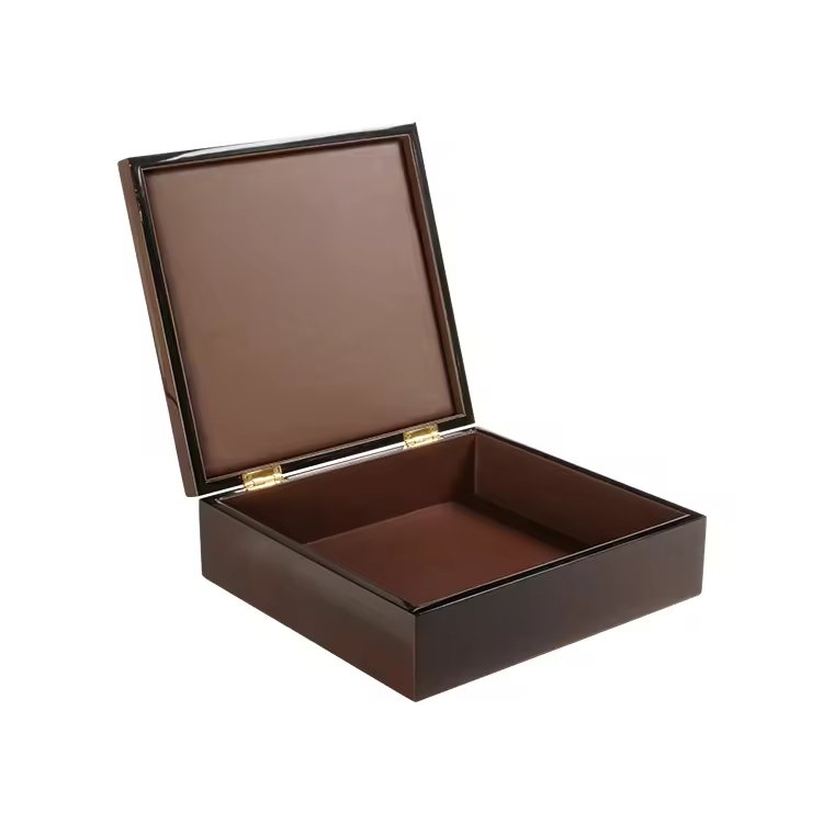
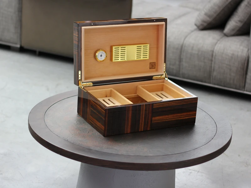
For example, if one brand favors black and the other gold, a black lacquer box with gold accents satisfies both. Material choices like mahogany veneer or piano lacquer add neutral sophistication.
Unifying design tools
| Shared Element | Function in Unification | Effect on Packaging |
|---|---|---|
| Color palette | Harmonizes contrast | Elegant, not chaotic |
| Material choice | Common ground for craft | Premium continuity |
| Finish technique | Shared execution style | Visual harmony |
One collaboration I worked on unified a red-and-gold luxury palette. Both logos looked natural, because the colors served both heritages.
In what way can logos be arranged to achieve balance without overshadowing each other?
Logo arrangement is one of the most delicate co-branding tasks.
Balanced logo placement prevents one identity from overshadowing the other, creating equality or hierarchy depending on the partnership’s nature.
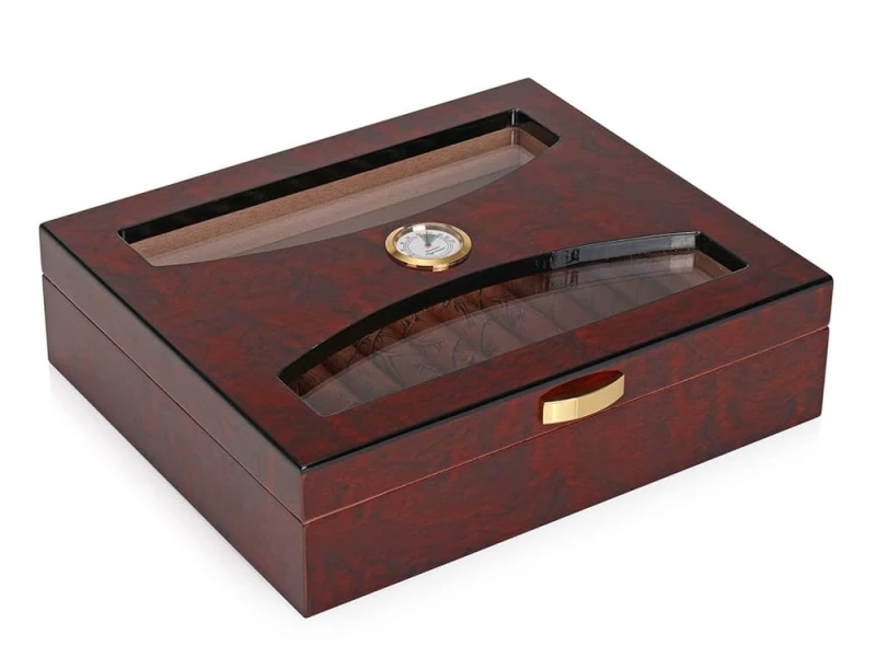
Techniques include placing logos side by side, stacking them vertically, or embedding one within a commemorative emblem. Size proportion signals lead vs. partner role.
Logo arrangement strategies
| Placement Style | Partnership Signal | Collector Perception |
|---|---|---|
| Side-by-side | Equal relationship | Collaboration of equals |
| Stacked hierarchy | Lead + supporting partner | Clear identity roles |
| Combined emblem | Fusion identity | Unique collectible symbol |
I once embedded two crests into a circular emblem. Collectors praised it as “a new identity born from both brands.”
How does storytelling help merge different brand cultures into one cohesive visual?
Logos and colors are not enough—stories unify deeper.
Storytelling merges cultures by highlighting the reason for collaboration, giving the box a shared narrative that transcends visual differences.
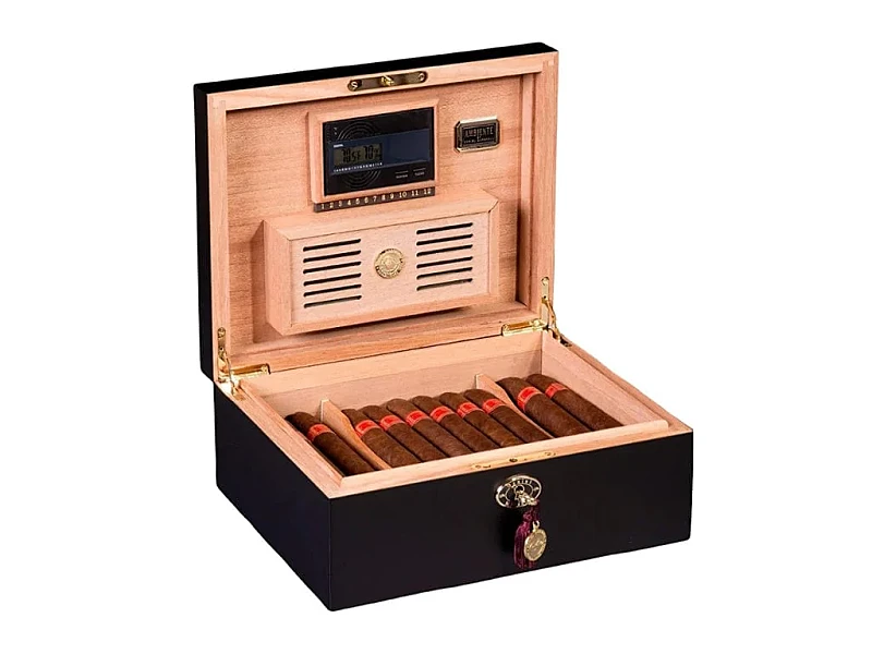
For example, if one brand is rooted in Cuban heritage and the other in modern luxury, the packaging can depict “heritage meets innovation.” This gives coherence to the design.
Storytelling integration
| Collaboration Story | Visual Translation | Consumer Emotion |
|---|---|---|
| Heritage + modern | Classic structure + modern finish | Timeless but fresh |
| Regional alliance | Motifs from both cultures | Authentic global pride |
| Anniversary tribute | Dates and shared symbols | Historic significance |
I once produced a joint edition celebrating “100 years of tradition + 20 years of innovation.” Collectors said the story “explained the union better than design alone.”
Why should the packaging structure remain simple when combining two visual languages?
Complexity in form plus complexity in branding creates overload.
Keeping the structure simple provides a calm stage for two visual languages to coexist without conflict.

Straightforward box proportions, smooth lids, and clean edges allow logos, finishes, and symbols to shine. A complex structure would compete with the already dual visual system.
Structural simplicity benefits
| Design Choice | Effect on Collaboration | Consumer Impact |
|---|---|---|
| Simple silhouette | Neutral stage | Focus on logos/stories |
| Standard clasp/hinge | Avoids extra noise | Clarity and balance |
| Flat lid surface | Space for shared elements | Prestige presentation |
In one project, we avoided hidden compartments or bold shapes. Clients said, “The simplicity gave the co-branding room to breathe.”
How can limited-edition cues (numbering, emblem, signature detail) emphasize collaboration rather than competition?
Limited editions are perfect platforms for collaborations.
Numbering, shared emblems, and signatures emphasize collaboration by shifting focus from rivalry to rarity and collectibility.
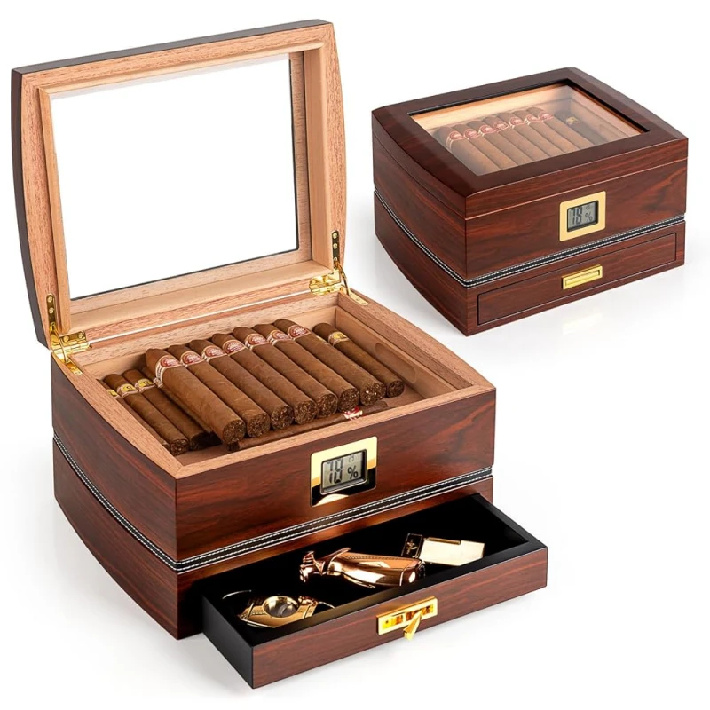
For example, engraving “No. 57/300 – Joint Edition” or creating a combined emblem reminds buyers they own a unique piece of history.
Limited-edition collaboration cues
| Cue Type | Effect on Packaging | Collector Perception |
|---|---|---|
| Serial numbering | Confirms exclusivity | Prestige and pride |
| Shared emblem | Creates fusion identity | Collectible authenticity |
| Maker’s signatures | Personal touch | Emotional connection |
I once delivered a batch with dual signatures—one from each brand’s master blender. Buyers said it felt like “a handshake in wood.”
Conclusion
Co-branded cigar boxes succeed when they clarify brand hierarchy, share palettes, balance logos, tell a unified story, keep structure simple, and use limited-edition cues. This turns collaboration from competition into prestige.
Brand Name: WoodoBox
Slogan: Custom Wooden Boxes, Crafted to Perfection
Website: www.woodobox.com
WhatsApp:** +86 18359265311

