
Luxury is not just about beauty—it is also about power. For cigar brands, packaging that projects authority reassures buyers of heritage, trust, and prestige.
Wooden box visuals create authority through bold structures, commanding colors, institutional symbols, and refined typography. This is vital for premium brands to project credibility and dominance.
Let’s break down how design achieves this.
Without authority, a brand risks looking weak or unproven. Cigars are cultural icons, and their packaging must reflect that status.
Authority builds trust by signaling that the brand is established, confident, and worthy of respect.

When a cigar box feels commanding, buyers believe in the brand’s heritage and quality. Authority turns a purchase into an endorsement of prestige.
Authority psychology
| Factor | Why It Matters | Consumer Impact |
|---|---|---|
| Authority cues | Signal stability | Trust in authenticity |
| Prestige signals | Reflect leadership | Emotional reassurance |
| Visual dominance | Suggests exclusivity | Higher perceived value |
I once worked with a European client who replaced playful motifs with strong, classic visuals. Collectors described the brand as “serious and confident” overnight. Authority changed perception instantly.
Weak structures undermine authority. Strong structures convey dominance.
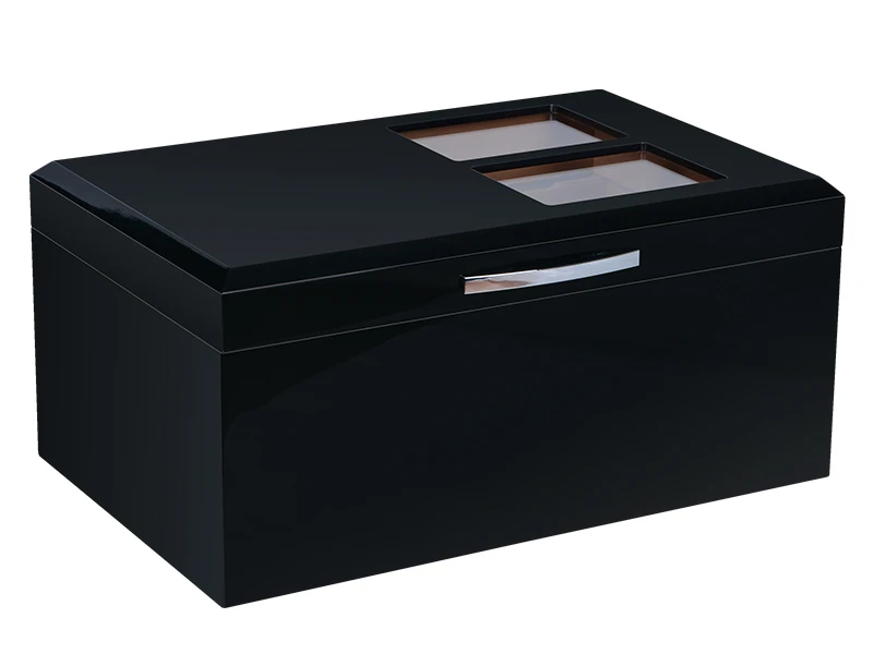
Bold forms, sharp edges, and balanced proportions express power because they feel architectural and permanent.

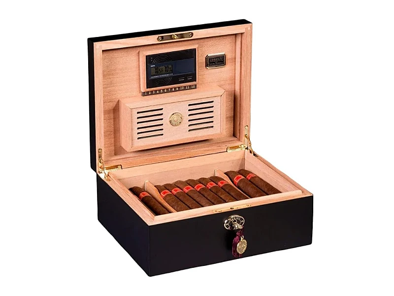
Thicker lids, square proportions, and sharp corners give the impression of weight and control. This makes the box feel like an artifact of importance, not just a container.
Structural authority cues
| Structural Choice | Authority Effect | Consumer Response |
|---|---|---|
| Thick walls | Stability and permanence | Confidence in durability |
| Sharp edges | Precision and control | Respect for craft |
| Solid proportions | Balance and harmony | Sense of prestige |
I once designed a box with beveled, thick edges. Customers said it felt “like a vault.” The structural choices created perceived power.
Colors act as the most immediate authority signals.
Deep black, rich mahogany, and gold accents reinforce authority because they evoke seriousness, tradition, and institutional prestige.
Black communicates strength and sophistication. Mahogany reflects heritage and tradition. Gold accents elevate both, signaling wealth and power.
Authoritative colors
| Color Choice | Authority Meaning | Brand Message |
|---|---|---|
| Deep black | Strength and exclusivity | Prestige and power |
| Mahogany brown | Heritage and tradition | Authentic craftsmanship |
| Gold accents | Wealth and nobility | Institutional authority |
One Middle Eastern client used black piano lacquer with gold foil. Collectors said the boxes looked “as powerful as royal insignias.” Colors alone delivered authority.
How does the use of heraldic symbols, crests, or seals communicate institutional prestige?
Symbols make authority official. They connect brands to tradition and institutions of power.
Crests, seals, and heraldic motifs communicate institutional prestige by referencing dynasties, academies, and nobility.
When placed on a box, these elements tell buyers the brand is not just a company—it is an institution. The symbols serve as cultural proof of authority.
Symbolic authority cues
| Symbol Type | Authority Signal | Consumer Perception |
|---|---|---|
| Heraldic crest | Nobility and lineage | Legacy and respect |
| Gold seal | Authentic certification | Proof of authority |
| Institutional emblem | Formal prestige | Trust and confidence |
A Cuban-inspired brand I worked with embossed its crest in gold. Collectors described it as “feeling like a state emblem.” The symbolism alone elevated the brand.
Typography carries authority in its voice. Overly decorative fonts weaken credibility.
Minimal yet commanding typography strengthens authority by delivering clarity, stability, and confidence without distraction.

Serif fonts echo tradition and heritage. Bold, clean lettering projects confidence. The absence of clutter makes every word feel stronger.
Typography authority impact
| Font Style | Authority Effect | Ideal Use |
|---|---|---|
| Classic serif | Heritage and tradition | Legacy cigar brands |
| Bold sans serif | Modern authority | Contemporary luxury lines |
| Embossed lettering | Tangible authority | Premium limited editions |
I once redesigned a brand’s logo with simple serif type, gold-embossed on mahogany. Collectors called it “timeless and powerful.” Typography alone shaped authority.
Too much authority risks coldness. Elegance softens it.
Balancing authority with elegance prevents intimidation by adding refinement, proportion, and tactile details to commanding visuals.
A box with sharp edges and black lacquer may feel too severe. Adding satin finishes, subtle embossing, or smooth textures balances the impression, making it inviting while still powerful.
Balance strategy
| Authority Element | Elegance Balance | Result |
|---|---|---|
| Deep black lacquer | Satin matte texture | Prestige with warmth |
| Bold crest | Subtle embossed framing | Institutional but refined |
| Sharp edges | Polished corners | Power with sophistication |
A Swiss brand I supported paired strong proportions with hand-polished lacquer. Collectors said it felt “powerful but not aggressive.” Balance gave dignity to authority.
Conclusion
Authority in cigar box design comes from bold structures, commanding colors, heraldic symbols, and confident typography—balanced with elegance. It builds trust and prestige, which are essential for premium brands.
Brand Name: WoodoBox
Slogan: Custom Wooden Boxes, Crafted to Perfection
Website: www.woodobox.com
WhatsApp:** +86 18359265311