Not all cigar buyers look at packaging the same way. Collectors and first-time users often value very different design elements. Ignoring this gap risks losing one group or confusing both.
Collectors tend to prefer intricate, heritage-rich packaging, while new users often respond better to clean, modern, and approachable designs. A dual strategy can serve both without losing brand identity.
Let’s explore how preferences diverge.
Why do collectors often value intricate details, heritage symbols, and storytelling in packaging?
Collectors treat cigar boxes as artifacts, not just containers.
They value intricate craftsmanship, heraldic symbols, and narrative elements because these turn packaging into heritage pieces with long-term display and collectible value.

For them, embossing, engraved crests, anniversary dates, or family seals are not decoration—they are proof of authenticity. Each detail enhances the sense of history.
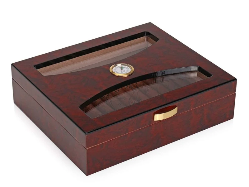
Collector preferences
| Feature | Collector Value | Emotional Response |
|---|---|---|
| Detailed crests | Link to heritage | Prestige and loyalty |
| Storytelling motifs | Brand history visible | Emotional attachment |
| Complex finishes | Craftsmanship showcase | Perceived rarity |
I once worked on a numbered commemorative series with embossed seals. Collectors described it as “packaging that deserves its own shelf.”
How can new users be more attracted to clean, modern, and approachable visuals?
New smokers may feel overwhelmed by tradition-heavy design. Simpler visuals help them feel included.
Clean layouts, modern finishes, and approachable colors signal accessibility, making cigars feel less intimidating for newcomers.
Minimal logos, lighter tones, and matte finishes make the experience feel more contemporary. For new users, clarity is more attractive than ornate heritage symbols.
New user preferences
| Feature | Appeal for New Users | Consumer Emotion |
|---|---|---|
| Clean design | Easy to understand | Comfort and openness |
| Modern fonts | Contemporary feel | Relevance and freshness |
| Light finishes | Softer presentation | Smooth entry into category |
One client used white satin lacquer for a beginner-friendly line. Customers said it looked “modern, like luxury fashion,” rather than intimidating.
In what way does perceived rarity or exclusivity affect collector-oriented design choices?
Collectors respond strongly to the idea of scarcity.
Packaging that emphasizes exclusivity—numbering, rare materials, or special emblems—creates perceived rarity and drives collector demand.

Elements like “No. 42/300” or exotic wood veneers turn packaging into artifacts. The rarity itself becomes part of the appeal, beyond the cigars inside.
Exclusivity drivers
| Design Cue | Collector Effect | Market Outcome |
|---|---|---|
| Numbered editions | Uniqueness | Higher collectible value |
| Exotic finishes | Luxury rarity | Desire for ownership |
| Commemorative marks | Cultural or historic link | Emotional pride |
A Cuban-inspired anniversary edition I designed used brass plaques with numbering. Collectors treated it as art to preserve, not just packaging.
Why might simplicity and clarity in design reduce intimidation for entry-level consumers?
Complexity can overwhelm. Entry-level consumers often want reassurance.
Simple structures, clear typography, and straightforward visuals reduce intimidation by making the product feel approachable and easy to navigate.
When the box is uncluttered, it feels welcoming. This encourages trial purchases from customers who might otherwise hesitate.
Simplicity benefits
| Design Element | Consumer Effect | Resulting Perception |
|---|---|---|
| Clear typography | Easy readability | Confidence to choose |
| Minimal motifs | Less cultural barrier | Friendly entry point |
| Neutral colors | Calm aesthetic | Accessibility |
I saw a U.S. boutique brand launch matte beige boxes for its mild blends. Many first-time smokers said they chose it because it “looked simple and safe.”
How can brands segment their packaging strategy to appeal to both groups without diluting identity?
Segmentation means designing for both audiences while keeping core identity intact.
Brands can anchor all boxes with shared DNA (logo, structure) but vary complexity, finish, and storytelling depth depending on audience.
Collectors get ornate, layered designs in limited editions. New users get simplified versions of the same DNA in core lines. This balance avoids dilution.
Segmentation strategy
| Target Group | Packaging Approach | Shared DNA Anchor |
|---|---|---|
| Collectors | Intricate, exclusive details | Crest, brand typography |
| New users | Clean, modern simplicity | Same logo, lighter finishes |
I once guided a Dominican brand to standardize its crest placement across all boxes. Collectors saw heritage, while new users found comfort in consistent recognition.
Should limited editions target collectors while core lines focus on accessibility for newcomers?
Yes—this is often the most effective division.
Limited editions are best for collector focus, while core lines should remain accessible to newcomers who drive volume sales.

Limited runs allow experimentation, elaborate storytelling, and expensive materials. Core lines can stay simple, approachable, and globally recognizable.
Strategic division
| Line Type | Audience Focus | Packaging Role |
|---|---|---|
| Limited editions | Collectors, enthusiasts | Showcase exclusivity |
| Core collections | New or casual users | Build trust and accessibility |
One client used this exact strategy: ornate anniversary editions for collectors, matte cedar boxes for core lines. Both groups felt understood, and the brand identity remained consistent.
Conclusion
Collectors value detail, heritage, and rarity, while new users prefer simplicity, clarity, and modernity. A dual strategy—exclusive limited editions for enthusiasts and approachable core lines for newcomers—lets brands serve both groups without losing identity.
Brand Name: WoodoBox
Slogan: Custom Wooden Boxes, Crafted to Perfection
Website: www.woodobox.com
WhatsApp:** +86 18359265311