I often see perfume brands struggle to explain why their packaging feels “off” at first glance. The problem usually appears before material or color. The real issue is geometry.
Box geometry shapes first judgment in seconds. It decides whether a customer feels confidence or doubt before they touch anything.
I have worked with luxury perfume brands for over 15 years. From my experience, shape always speaks first in retail.
I want to explain how geometry works in luxury perfume boxes, and why it quietly controls perception, shelf presence, and brand trust.
How do proportions and symmetry influence perceived luxury at first glance?
When proportions feel wrong, customers feel uneasy. They may not know why, but they hesitate.
Balanced proportions and clear symmetry signal control, experience, and intention.
Why the eye judges proportion first
The human eye reads shape faster than texture or color. This happens automatically. When a box feels too tall, too wide, or visually unstable, the brain registers tension.
In luxury perfume retail, tension rarely works in your favor.
From my production experience, I see this mistake often. A brand selects premium wood, piano lacquer, and metal logos. But the box feels heavy at the bottom or awkward at the lid. The result feels expensive but uncertain.
Symmetry creates psychological comfort
Symmetry suggests order. Order suggests mastery.
Luxury brands depend on this effect. When a box is symmetrical from front, side, and top views, it feels reliable. It feels complete.
I often guide clients to start with symmetry before exploring creative changes. Once symmetry feels right, small breaks can be added with purpose.
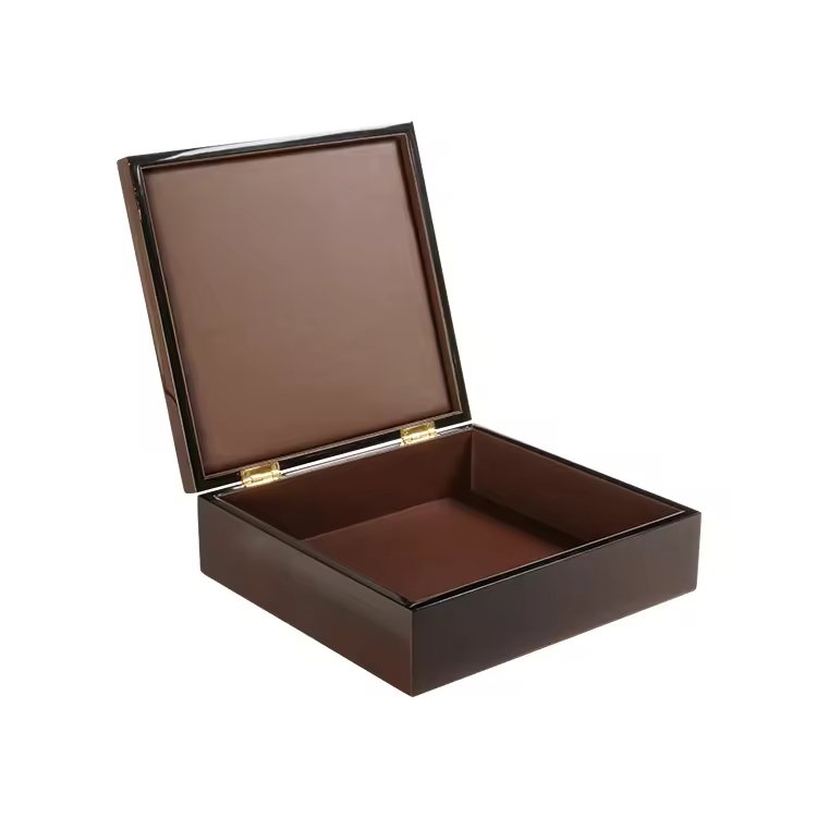
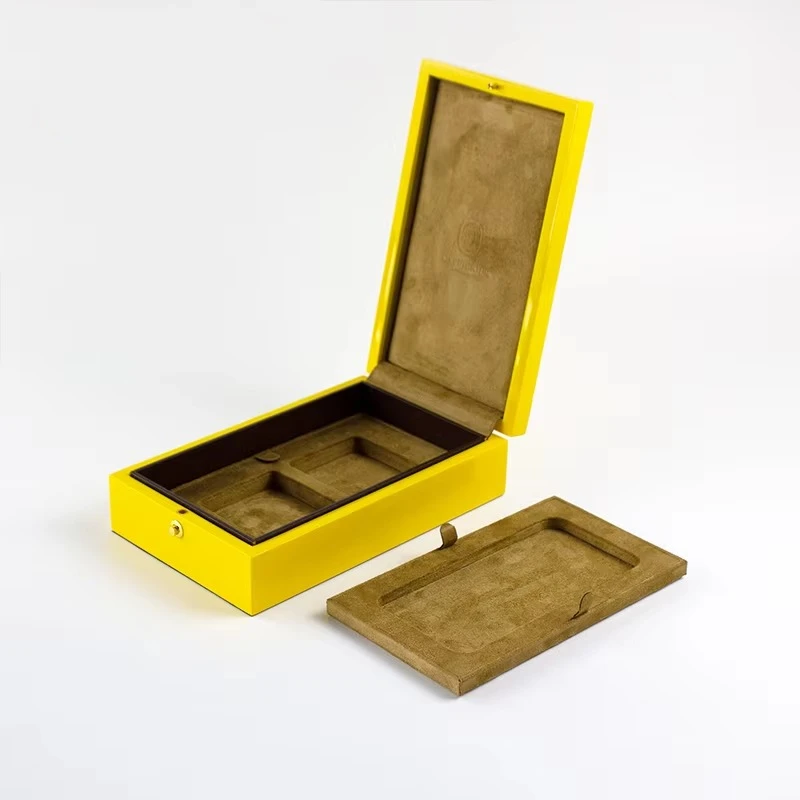
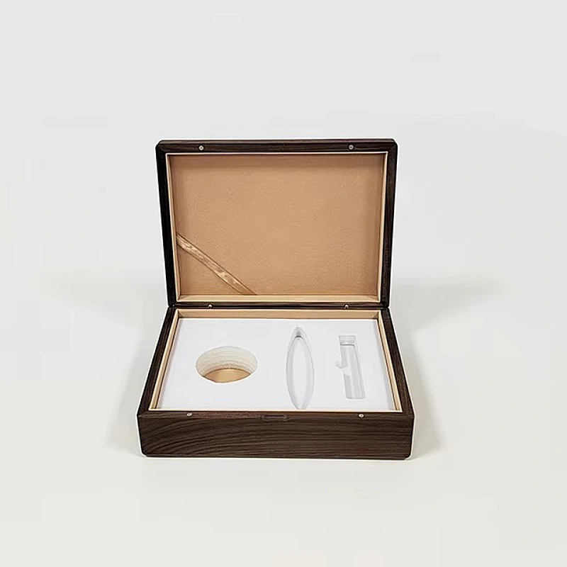
Proportion types that work well in perfume boxes
Here are common proportion strategies I see succeed:
| Proportion Type | Visual Effect | Best For |
|---|---|---|
| Perfect cube | Stability and control | Minimalist luxury brands |
| Tall vertical | Elegance and confidence | High-end niche perfumes |
| Elongated horizontal | Calm and maturity | Heritage or classic brands |
| Slim profile | Precision and restraint | Modern luxury positioning |
Poor proportion usually comes from guessing. Strong proportion comes from testing and measuring.
My personal takeaway
When proportions feel right, customers relax. They trust the brand faster. That trust begins before any logo appears.
Soft shapes often feel friendly. But in luxury perfume, friendliness is not the goal.
Sharp and clear geometry signals discipline, precision, and authority.
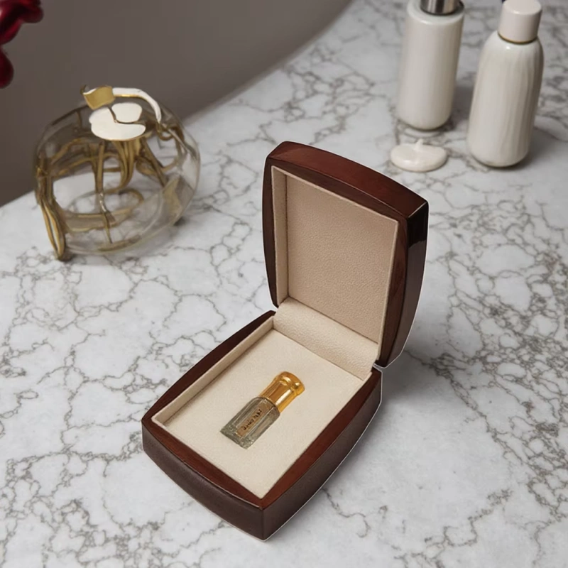
Sharp edges suggest confidence
Clean edges and flat planes show control. They tell the customer that the brand knows exactly what it is doing.
In wooden perfume boxes, sharp geometry is difficult to execute. It requires accurate cutting, stable material, and skilled finishing. Customers may not know this, but they feel it.
That is why sharp geometry feels premium.
The danger of unclear shapes
Unclear geometry feels undecided. It feels like compromise.
I have seen many designs where corners are slightly rounded, surfaces are slightly curved, and angles are not consistent. The result feels soft in a weak way.
This softness often comes from fear. Brands worry that sharp geometry may feel cold. But in luxury, clarity is warmth.
When soft geometry actually works
Soft shapes can work when they are extreme and controlled.
Examples include:
- Fully rounded edges with perfect consistency
- Smooth curves paired with flawless lacquer
- Organic shapes that match a strong brand story
These designs cost more to produce. They demand higher tooling and tighter quality control.
Geometry and craftsmanship connection
From a manufacturing view, sharp geometry exposes mistakes. Soft geometry hides them.
Luxury brands choose sharp geometry because they trust their process.
That trust becomes visible.
How does box geometry guide the customer’s eye on a retail shelf?
Retail shelves are crowded. Geometry decides which box gets noticed without shouting.
Strong geometry guides the eye naturally, without relying on color or graphics.
Breaking visual rhythm
Most perfume shelves follow patterns. Similar heights. Similar widths. Similar silhouettes.
A box that breaks this rhythm attracts attention immediately.
I have seen brands succeed simply by choosing a vertical geometry in a horizontal environment.
Eye movement and geometry
The eye follows lines.
- Vertical boxes draw attention upward
- Horizontal boxes slow the gaze
- Diagonal elements create tension
- Clean rectangles feel calm and premium
Geometry controls how long a customer looks at your product.
Shelf presence without noise
Luxury does not compete with brightness. It competes with confidence.
A strong silhouette allows:
- Minimal printing
- Subtle logos
- Neutral colors
Geometry does the heavy work.
Practical shelf comparison
| Shelf Environment | Geometry Strategy | Result |
|---|---|---|
| Crowded niche shelf | Tall and slim box | Immediate visibility |
| Department store counter | Solid cubic box | Authority and stability |
| Boutique display | Unique proportion | Memorability |
From my experience, geometry often solves shelf problems faster than graphic redesigns.
In what way does structural geometry communicate brand confidence and positioning?
Geometry is not decoration. It is positioning.
Structure tells the customer who you are before they read your brand name.
Geometry as brand language
Every brand has a tone. Geometry expresses that tone silently.
- Architectural shapes suggest maturity
- Simple forms suggest restraint
- Experimental forms suggest creativity
The key is consistency.
Minimalist brands and geometry
Minimalist luxury brands rely heavily on geometry. They remove noise. What remains must be perfect.
This is why minimalist boxes often look simple but cost more to produce.
Artisanal and niche positioning
Some niche perfume brands choose irregular geometry on purpose. Slight asymmetry. Hand-like proportions.
This only works when:
- The irregularity is intentional
- The craftsmanship level stays high
- The story supports the shape
Random geometry always fails. Intentional geometry always speaks.
Geometry and price perception
Customers link geometry to price subconsciously.
| Geometry Type | Perceived Price Level |
|---|---|
| Clean and precise | High |
| Over-designed | Unclear |
| Soft and vague | Lower |
| Confident and simple | Premium |
I often advise clients to adjust geometry before adjusting cost.
How can distinctive geometry help a perfume brand stand out without loud design?
Luxury prefers silence over noise.
Distinctive geometry creates memorability without shouting.
Standing out through restraint
Many brands try to stand out with color or graphics. This often dates quickly.
Geometry lasts longer.
A strong shape remains recognizable even without branding.
Long-term brand assets
When geometry becomes part of identity, it turns into an asset.
Customers remember:
- The tall black box
- The perfect cube
- The slim vertical case
This memory builds brand equity over time.
Production discipline matters
Distinctive geometry requires discipline.
- Tight tolerances
- Stable materials
- Consistent assembly
This is where many brands hesitate. But this is also where luxury is born.
Quiet confidence on the shelf
I have seen brands win attention simply by doing less.
A strong box shape. Neutral color. Clean finish.
The geometry does the talking.
Conclusion
Geometry answers the luxury question before words do. When shape feels confident and intentional, customers trust the brand instantly.
Brand Name: WoodoBox
Slogan: Custom Wooden Boxes, Crafted to Perfection