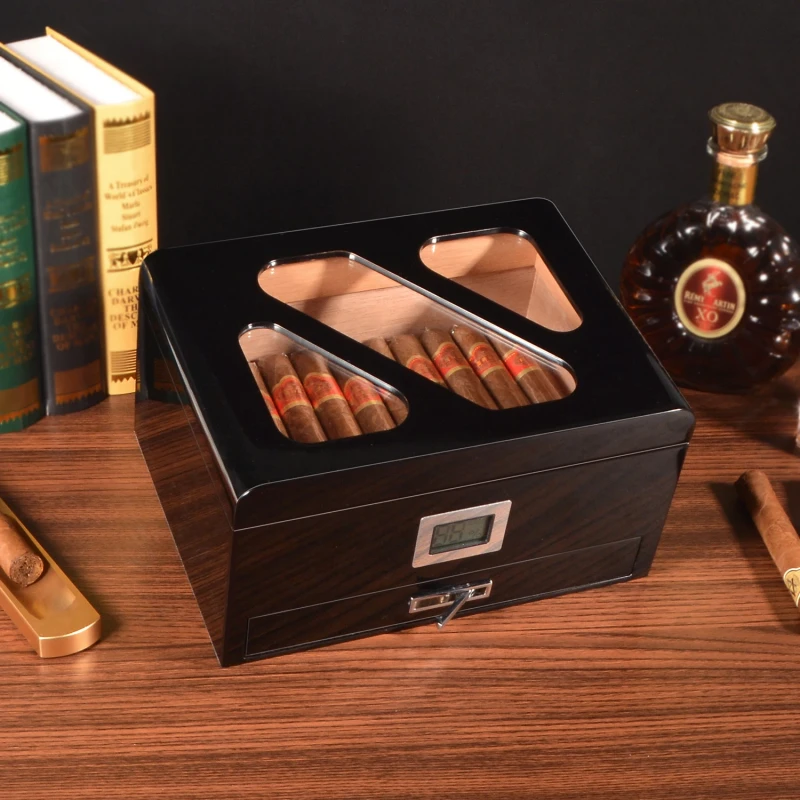
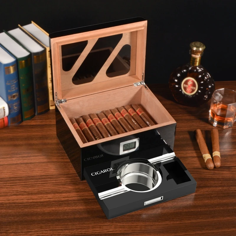
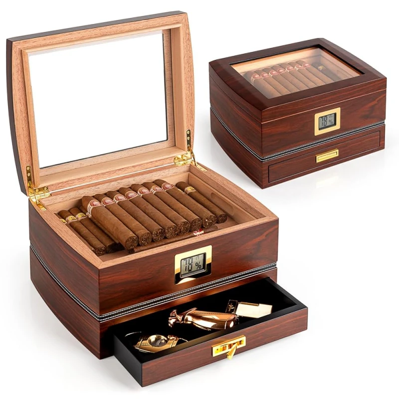
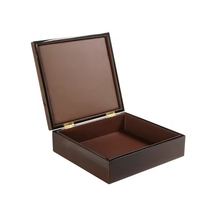
Cigar lovers often connect packaging with heritage and prestige. A wrong design choice may risk lowering the perceived luxury.
Yes, vintage paper labels can be luxurious if done with precision. When combined with fine wood, quality print, and balanced placement, they enhance tradition without looking cheap.
The key is not rejecting paper labels but understanding how to integrate them into high-end packaging. Let’s explore each angle carefully.
Why do vintage paper labels carry strong storytelling and nostalgic appeal in cigar culture?
Collectors often feel drawn to classic cigar box labels because they link directly to history. If ignored, brands miss this deep emotional connection.
Vintage paper labels tell stories of heritage, travel, and exclusivity. Their nostalgic details remind smokers of a time when cigars symbolized refined taste.
When I design a cigar box with a vintage-inspired paper label, I know it connects modern buyers with traditions from Havana, Santo Domingo, or Nicaragua. These labels often feature coats of arms, ships, or royal motifs. They trigger a sense of time travel. For buyers, the cigar becomes more than tobacco; it becomes a cultural artifact.
Storytelling through visual codes
Old labels were never random. They used rich reds, golds, and complex borders. These symbols spoke of power and prestige. Today, when I work with designers, I encourage them to research archives. A proper reproduction of vintage symbols creates authenticity.
Nostalgia as a value
In luxury, nostalgia is not weakness. It adds depth. People often pay more for an item that makes them feel part of a legacy. That is why limited cigars with vintage-inspired labels sell faster. Nostalgia creates an emotional anchor.
| Visual Element | Emotional Effect |
|---|---|
| Coat of arms | Authority and prestige |
| Sailing ships | Travel, discovery, adventure |
| Portraits | Legacy and timelessness |
| Gold borders | Wealth and exclusivity |
For me, vintage labels are not decoration. They are storytelling tools. They must be used with the same respect as wood choice or lacquer finish.
How can paper labels highlight tradition without looking cheap or outdated?
Some worry that paper labels look fragile. If poorly printed, they may feel cheap. This fear is valid.
The key is paper quality, print detail, and integration with the wooden box. Premium paper labels look refined, not outdated.
When I help clients with cigar box designs, I always recommend special paper types. Simple glossy paper looks ordinary. But textured paper or cotton-based paper feels rich in hand. Combined with aged-style artwork, the label reflects craftsmanship.
Avoiding the “cheap” trap
Brands often fail when they print vintage labels on thin paper with flat ink. It looks mass-market. That is why I insist on heavier paper stock. Even when customers touch the label, it feels substantial.
Design adaptation
Vintage does not mean copying old designs blindly. Modern buyers still want clean visuals. I often adjust colors, simplify borders, or reduce overcrowding. This keeps the heritage while removing the clutter.
| Risk | Solution |
|---|---|
| Flat printing | Use foil or emboss for depth |
| Thin paper stock | Choose thick textured paper |
| Overcrowded design | Simplify with modern balance |
| Weak adhesion on wood | Use strong adhesives + lacquer |
When done right, paper labels act like a museum exhibit. They give value instead of reducing it.
Without advanced techniques, paper labels may look ordinary. The magic is in detail.
Embossing, foil stamping, and textured paper transform labels from flat prints into luxury elements that match premium woodwork.
I remember working on a cigar box project for a European client. They wanted a paper label but feared it would weaken the premium impression. We used gold foil stamping on the crest, embossing on the brand name, and a linen-textured base paper. The result impressed even their most critical buyers.
Key techniques explained
- Embossing: Raises patterns, adding tactile richness.
- Foil stamping: Adds reflective shine, symbolizing wealth.
- Textured paper: Enhances touch, making the box feel artisanal.
Why details matter
Luxury is often about touch as much as sight. When a cigar aficionado opens a box, their fingers slide across wood, velvet, and the paper label. If the label feels deep, not flat, it confirms premium status.
| Technique | Effect on Luxury |
|---|---|
| Embossing | Tactile richness |
| Gold foil | Visual prestige |
| Textured linen | Handmade feeling |
| Spot UV coating | Modern depth |
Printing techniques turn vintage paper labels into elements that can stand proudly next to piano lacquer finishes or brass hinges.
Why is the balance between wooden surface and paper label placement crucial for luxury expression?
If the label covers too much, wood loses its value. If too little, the label may feel irrelevant. Both extremes break luxury balance.
A luxury cigar box requires harmony. Paper labels should highlight the wood, not hide it. Strategic placement preserves both tradition and elegance.
In my design practice, I often advise clients to see the box as a stage. The wood is the actor, the paper label is the costume. If the costume covers everything, the actor disappears.
Placement strategies
- Centerpiece label: One strong front-facing label, leaving wood visible on all sides.
- Lid inside: Vintage label inside the lid, surprise element when box is opened.
- Side or corner strip: Decorative band that does not dominate.
Why balance matters
Luxury is about showcasing material quality. High gloss wood or deep-grain walnut is already premium. Covering it with paper is a mistake. The label must serve as accent, not mask.
| Placement | Effect |
|---|---|
| Full lid cover | Overpowering, hides wood |
| Corner placement | Elegant accent |
| Inside lid | Private luxury detail |
| Center small size | Balanced presentation |
Luxury buyers notice balance. They want both wood and label to speak. Neither should silence the other.
How can limited editions use vintage labels as a collectible feature rather than mass-market decoration?
If every box uses the same label, the charm is lost. Collectors want uniqueness.
Limited editions should treat vintage paper labels as art pieces, numbered and crafted, not as generic decoration.
I once worked with a client who released a 500-box limited run. Each box had a numbered vintage-style label, printed with letterpress. Buyers knew they were getting something rare. The labels became collectibles themselves.
Collectible strategies
- Numbering: Sequential print numbers (e.g., 001/500) add rarity.
- Year stamps: Mark production year for historical link.
- Special materials: Handmade paper for limited runs.
Avoiding overuse
If every cigar line uses the same vintage label, it loses prestige. The trick is to reserve detailed paper labels for limited editions. Standard lines can use wood branding or simpler designs.
| Collectible Element | Impact |
|---|---|
| Hand-numbered label | Increases exclusivity |
| Year-based artwork | Strengthens story |
| Artist collaboration | Adds cultural value |
For limited editions, paper labels should feel like owning a small artwork, not just packaging.
Should brands combine vintage labels with refined wood finishes to achieve both authenticity and elegance?
Some ask if vintage labels and glossy wood can coexist. The answer is yes.
When paired carefully, vintage labels and polished wood finishes create a balance of authenticity and elegance, pleasing both traditionalists and modern buyers.
In my factory, I have seen projects where clients chose rosewood veneer with high-gloss lacquer. They worried a paper label would look out of place. But with gold foil embossing and limited placement, the label enhanced the contrast. It told a story without hiding the wood.
Why combination works
Wood shows natural beauty. Paper shows cultural heritage. Together, they speak to both the eye and the mind.
Design guidelines
- Use glossy lacquer with minimal but rich label.
- Choose textured paper so label does not look flat against polished wood.
- Balance colors: dark woods go with gold/cream labels, lighter woods with deep red/black labels.
| Wood Finish | Best Label Style |
|---|---|
| Piano black gloss | Gold foil label |
| Dark walnut matte | Cream embossed |
| Mahogany lacquer | Red vintage print |
| Oak veneer | Black + gold mix |
When combined well, the label and wood are not rivals. They are partners in expressing both legacy and modern luxury.
Conclusion
Vintage paper labels, when used with care, do not weaken luxury. They enrich cigar boxes with history, craft, and storytelling.
Brand Name: WoodoBox
Slogan: Custom Wooden Boxes, Crafted to Perfection
Website: www.woodobox.com
WhatsApp: +86 18359265311


