In the premium cigar world, recognition is power. If a consumer can identify a brand before even reading the name, the packaging has succeeded.
Visual details like logos, colors, structures, typography, and continuity make cigar boxes instantly recognizable while subtle innovation keeps them fresh.
Let’s explore how these cues shape brand recall.
Why is a consistent signature element (logo, crest, or emblem) the foundation of instant recognition?
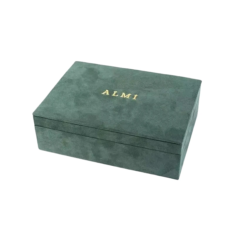
Logos and crests are timeless identifiers. Without them, consumers may confuse one brand for another.
A consistent emblem acts as the foundation of recognition by giving buyers a visual anchor that transcends markets and editions.
When placed consistently—on the lid, clasp, or inside panel—logos become brand signatures. Even when other design aspects evolve, this symbol ensures continuity.
Signature element role
| Signature Element | Function in Recognition | Consumer Effect |
|---|---|---|
| Crest or emblem | Heritage anchor | Prestige and trust |
| Logo placement | Fixed brand position | Visual familiarity |
| Embossed seal | Tactile identifier | Memorable authenticity |
I once worked with a brand that repositioned its crest across releases. Collectors complained it “felt like a different brand.” Returning to consistency restored recognition.
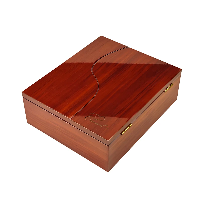
How can unique color palettes or finishes become a brand’s visual DNA?
Colors speak faster than words. They become subconscious identifiers.
Unique palettes and finishes form visual DNA by creating associations that consumers instantly link to the brand.
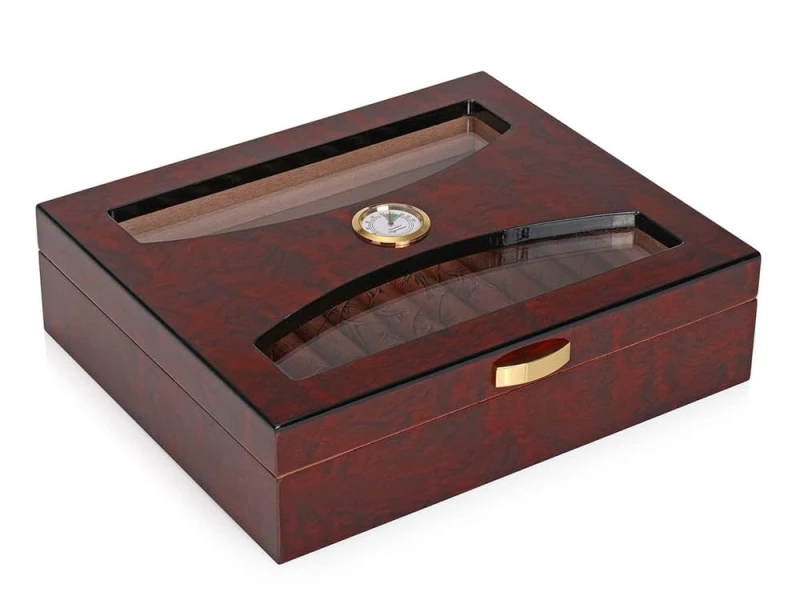
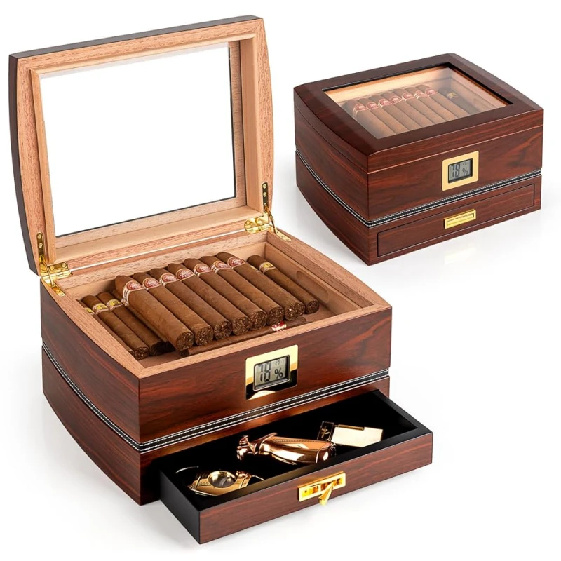
Deep mahogany lacquer, matte black with gold, or ivory satin can serve as brand trademarks. When repeated, these finishes become inseparable from the brand’s identity.
Color and finish cues
| Color/Finish Choice | Brand Signal | Consumer Recognition |
|---|---|---|
| Deep mahogany | Classic tradition | Heritage association |
| Matte black + gold | Modern authority | Premium exclusivity |
| White satin lacquer | Minimalist elegance | Boutique distinction |
A Dominican brand I supported kept a signature burgundy lacquer for 20 years. Customers could spot it across a room.
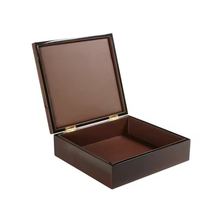
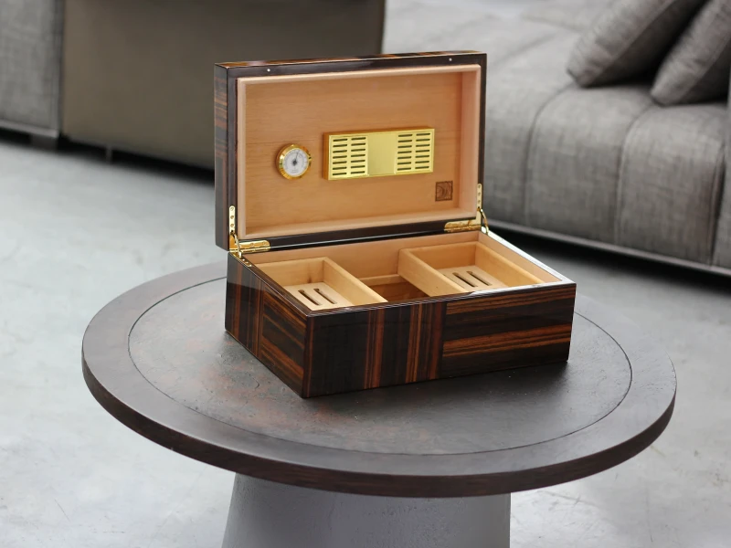
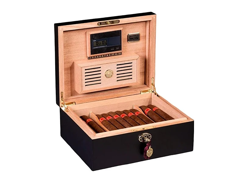
In what way do structural details (hinge style, clasp type, box proportion) act as identifiers?
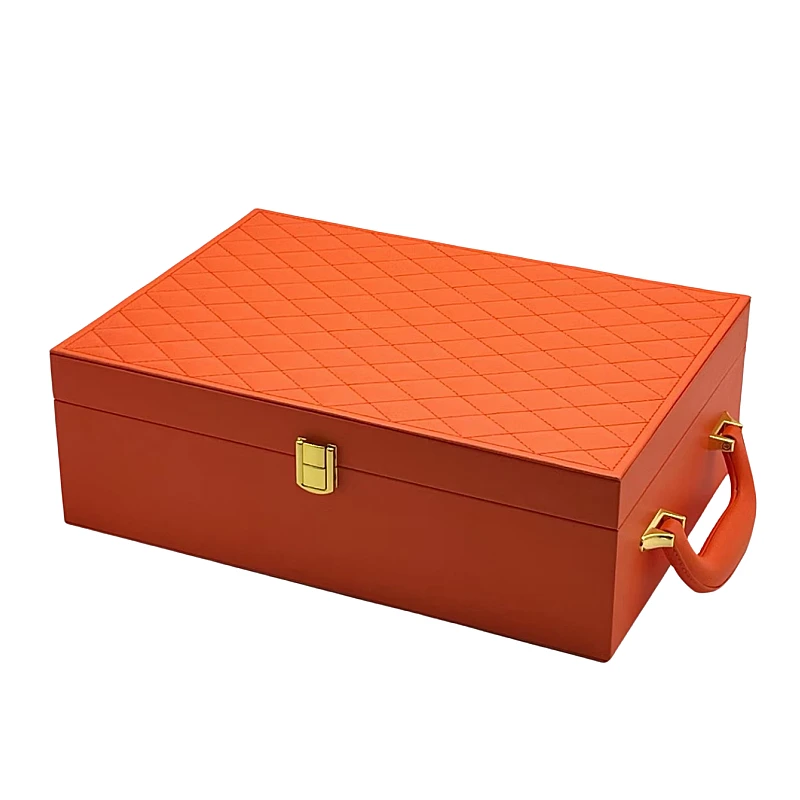
Visual DNA is not only surface-level—it is structural.
Structural details like hinge style, clasps, and proportions act as identifiers by giving physical form to the brand’s aesthetic.
Collectors often recognize a brand by how the box opens, its clasp’s shape, or its solid proportions. These tactile markers become just as important as graphics.
Structural identity cues
| Structural Detail | Recognition Effect | Prestige Value |
|---|---|---|
| Hidden hinges | Seamless elegance | Modern refinement |
| Brass clasps | Traditional luxury | Heritage authority |
| Thick proportions | Solid permanence | High-value perception |
I once created a line with beveled edges and magnetic locks. Even without logos, customers guessed the brand—structure itself became identity.
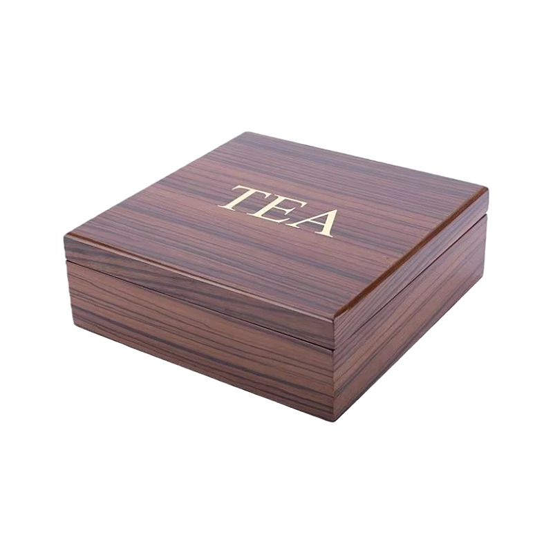
How does repetition of typography or graphic motifs build subconscious familiarity?
Typography is the voice of the brand. When consistent, it reinforces recognition.
Repetition of type and motifs builds subconscious familiarity, making buyers recognize the brand even in new contexts.
Classic serif fonts, embossed scripts, or repeated patterns like borders and seals become visual habits. Over time, consumers identify these as “belonging” to the brand.
Typography & motif role
| Visual Element | Recognition Function | Consumer Perception |
|---|---|---|
| Serif lettering | Heritage and trust | Classic cigar culture |
| Repeated borders | Decorative identity | Familiar framing |
| Embossed typeface | Premium authenticity | Strong tactile memory |
One Cuban-inspired brand always used ornate frames on lids. Collectors told me, “I can recognize them without reading the name.” Repetition built habit.
Why is maintaining design continuity across product lines crucial for brand recall?
If each product looks unrelated, brand memory fragments.
Continuity across product lines ensures recognition by creating a visual family that consumers link together.

Unified elements—logos, box proportions, or color accents—make every release feel part of the same brand, even if flavors or blends differ.
Continuity benefits
| Consistent Element | Continuity Effect | Consumer Impact |
|---|---|---|
| Logo/crest | Core recognition | Immediate brand link |
| Structural style | Family resemblance | Collector confidence |
| Color palette | Unified impression | Long-term memory |
I once saw a brand with inconsistent product lines. Customers asked, “Are these from the same company?” When unified, recognition and trust improved instantly.
How can subtle innovation refresh the look without losing recognizability?
Stagnation is as risky as chaos. Subtle updates keep brands fresh without breaking recognition.
Innovation should focus on finishes, textures, or limited-edition accents while preserving core identifiers.
For example, a matte finish may replace gloss, or foil color may change, but logo placement and structure remain. This creates freshness while keeping identity intact.
Innovation balance
| Preserved Constant | Changed Detail | Effect on Recognition |
|---|---|---|
| Logo placement | Foil color | Fresh but recognizable |
| Box proportion | Surface texture | Continuity with novelty |
| Typography style | Emboss vs. print finish | Updated tactile richness |
I once guided a client to use silver foil instead of gold for a seasonal line. Collectors loved the new feel but still recognized the brand instantly.
Conclusion
Cigar boxes become instantly recognizable when brands use consistent logos, unique color palettes, structural identifiers, typography repetition, and design continuity—while refreshing with subtle innovations.
Brand Name: WoodoBox
Slogan: Custom Wooden Boxes, Crafted to Perfection
Website: www.woodobox.com
WhatsApp: +86 18359265311