People often think scent speaks first. In reality, eyes speak earlier. When color sends the wrong signal, even a good perfume can feel wrong.
Packaging color strongly shapes how powerful a perfume is expected to be, even before the first spray. It sets a mental baseline that directly affects how strength, projection, and longevity are judged.
I have worked with perfume brands for more than fifteen years. I have seen this pattern repeat again and again. Customers smell with their eyes first. If the color promises strength, they feel strength. If it promises softness, they expect subtlety. The liquid inside does not change. Perception does.
How do color cues shape expectations before a perfume is even smelled?
People do not approach a perfume with a blank mind. The brain starts judging the moment the box appears.
When a customer sees a perfume on a shelf, color works faster than text. Faster than brand story. Faster than ingredients. In many cases, color decides whether the bottle is picked up at all.
Short, direct signals happen instantly. Dark often means strong. Light often means soft. Warm feels rich. Cool feels clean. These signals are learned from daily life, not from perfume education.
In my experience, this first visual moment decides how the nose will interpret the scent later.
Visual expectation comes before olfactory judgment
I often sit in sampling sessions with brand teams. We show the same perfume to different groups. One group sees dark packaging. Another group sees light packaging. The feedback changes even when the liquid stays the same.
People exposed to dark packaging often say:
- “It smells deep”
- “It feels strong”
- “It lasts long”
People exposed to light packaging often say:
- “It smells clean”
- “It feels gentle”
- “It is easy to wear”
This happens even before the dry down fully develops.
Color creates a mental reference point
The brain uses color as a shortcut. It sets a reference point for strength.
If the reference point is high, the perfume feels balanced.
If the reference point is low, the same perfume can feel overpowering.
This is why packaging color must be decided early in product development. It is not decoration. It is positioning.
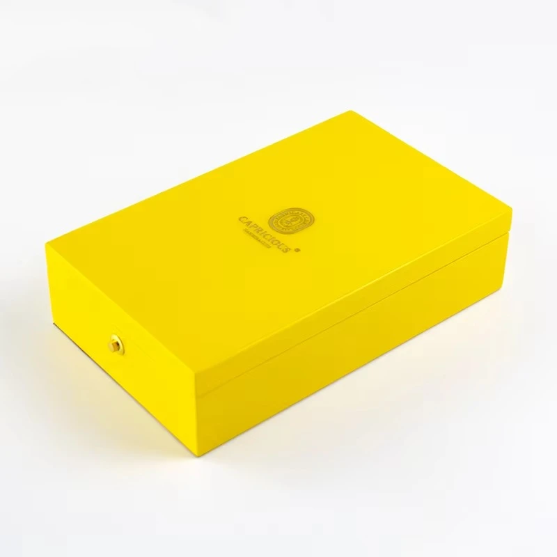
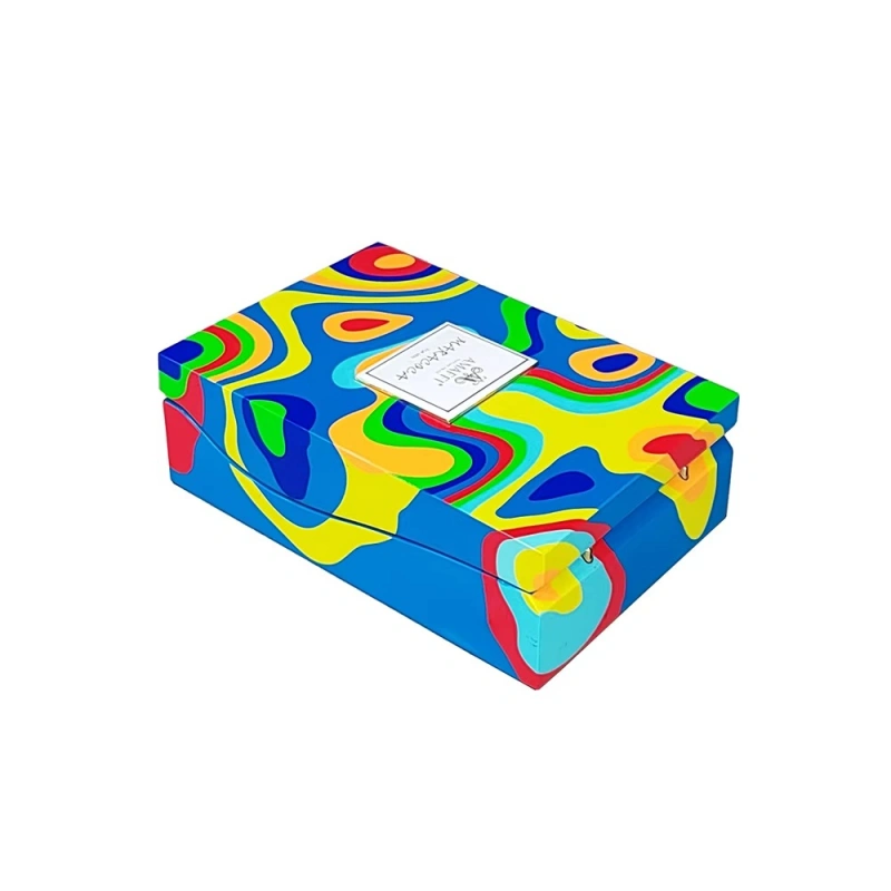
Common color associations in perfumery
| Color Type | Common Expectation | Strength Perception |
|---|---|---|
| Preto | Bold, serious, intense | Forte |
| Deep Brown | Warm, rich, mature | Forte |
| Borgonha | Sensual, heavy | Forte |
| Navy | Deep, stable | Médio a forte |
| Branco | Clean, pure | Luz |
| Pastel | Soft, airy | Luz |
| Beige | Natural, gentle | Subtle |
These are not rules. They are patterns formed by long-term consumer behavior.
When brands ignore these patterns, confusion appears.
Why are dark and saturated colors associated with stronger fragrances?
Dark colors carry emotional weight. They slow the eye down. They feel dense. This density transfers directly into how scent is judged.
In perfume packaging, darkness often equals seriousness.
Darkness signals depth and longevity
Dark colors absorb light. They feel heavy. This visual weight leads customers to expect:
- Stronger projection
- Longer lasting scent
- Deeper base notes
In real feedback sessions, customers often describe dark-packaged perfumes as “lasting longer” even when lab tests show no difference.
Saturation increases perceived power
Highly saturated colors feel concentrated. This matters.
A deep black feels stronger than light gray.
A rich burgundy feels stronger than pale pink.
This mirrors how people think about liquids. Concentrated looks powerful. Diluted looks weak.
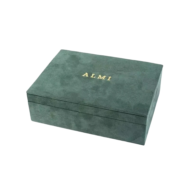
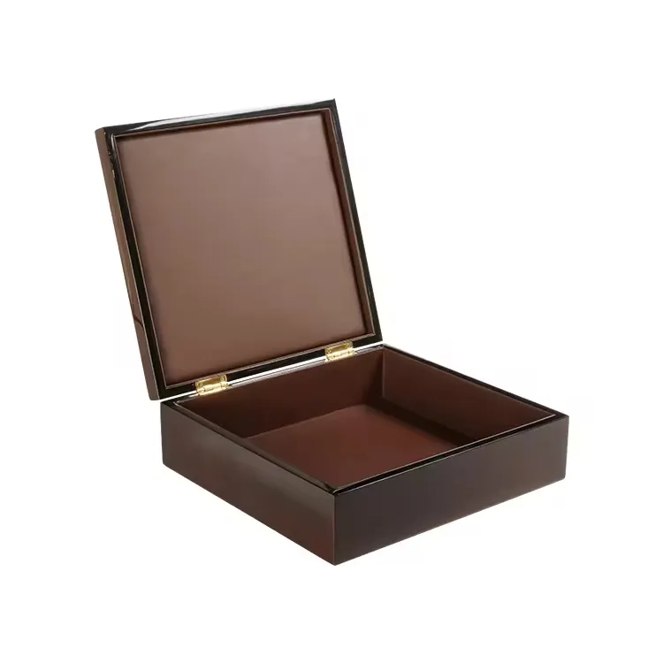
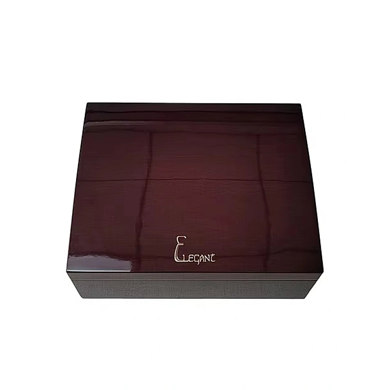
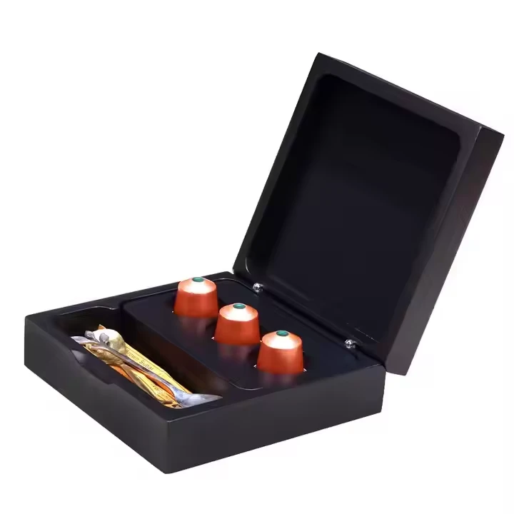
My experience with dark wooden boxes
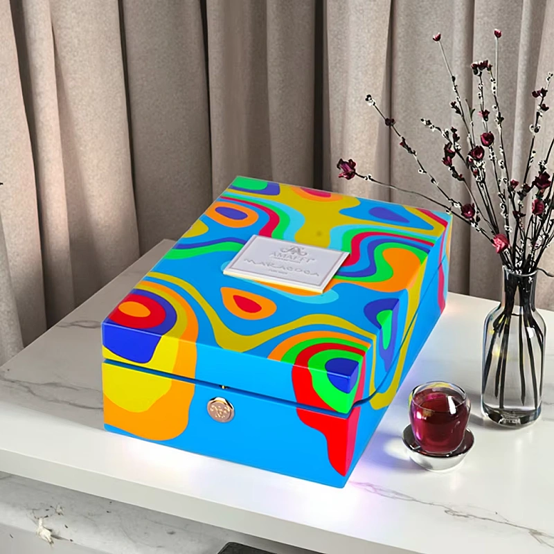
I have produced many dark wooden perfume boxes. Black piano lacquer. Deep walnut veneer. Dark green matte finishes.
When these boxes have real weight, customer comments change immediately.
They say:
- “This must be a strong perfume”
- “This feels expensive”
- “This is not for beginners”
The scent has not been smelled yet. The decision has already started.
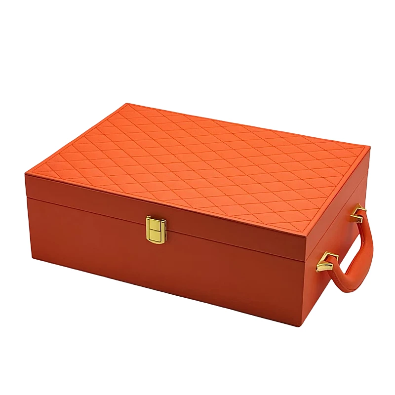
Dark colors and gender expectations
Dark packaging is also linked to traditional masculinity and evening wear. Even for unisex perfumes, dark colors push perception toward strength.
This is not about right or wrong. It is about expectation management.
How do light and neutral colors suggest softness and subtlety?
Light colors do the opposite of dark ones. They open space. They breathe. They feel safe.
This is why light colors work well for fresh, daily, and intimate perfumes.
Light colors reduce perceived intensity
White, cream, pastel pink, and light blue all signal:
- Cleanliness
- Airiness
- Skin closeness
When customers see these colors, they expect:
- Low projection
- Soft sillage
- Easy wear
If the perfume matches this promise, satisfaction is high.
Neutral tones create calm expectations
Beige, soft gray, and light wood tones feel natural. They reduce emotional pressure.
This works well for:
- Natural perfumes
- Skin scents
- Minimalist brands
These colors do not shout. They whisper.
Problems when light color meets strong scent
I have seen many launches fail because of this mismatch.
A very strong perfume in a white box often gets comments like:
- “Too strong”
- “Overwhelming”
- “Not what I expected”
The scent did not change. The promise did.
When light packaging works perfectly
Light packaging is powerful when aligned correctly.
It works best when:
- The scent is fresh or floral
- The concentration is moderate
- The goal is daily wear
In these cases, customers feel trust. Trust leads to repeat purchase.
How does color interact with bottle weight, material, and box texture to amplify perception?
Color never works alone. It always interacts with physical elements.
In my factory work, I see this clearly. The same color behaves very differently on different materials.
Weight reinforces strength
Heavy packaging feels serious. Light packaging feels casual.
A dark color on a heavy wooden box feels powerful.
The same dark color on thin paper feels empty.
Weight tells the hands what the nose should expect.
Material changes how color is read
Here is how materials affect color perception:
| Material | Effect on Color | Intensidade do sinal |
|---|---|---|
| Madeira maciça | Deepens color | Forte |
| MDF com folheado de madeira | Controlled, refined | Médio a forte |
| Vidro | Clean, sharp | Médio |
| Thin paper | Flat | Fraco |
| Acentos metálicos | Sharpens contrast | Forte |
This is why luxury brands often combine dark colors with rigid materials.
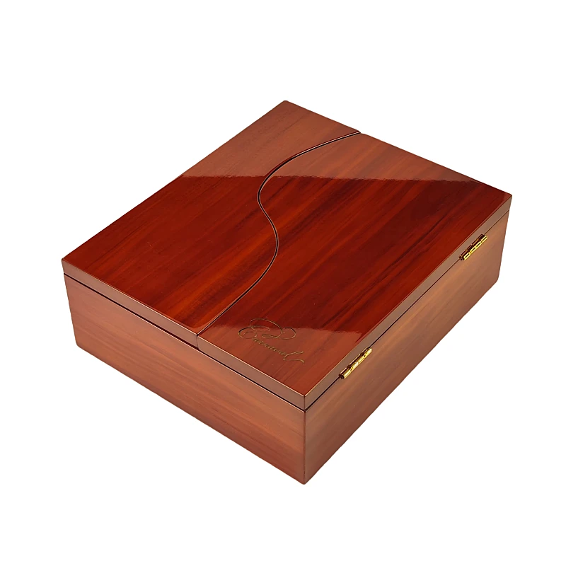
Texture adds emotional meaning
Matte finishes feel calm and serious.
High gloss feels bold and dramatic.
In piano lacquer boxes, dark colors become almost liquid. This creates a sense of richness and power.
I have seen customers touch the box before smelling. That touch already shapes their judgment.
Alignment creates harmony
When color, weight, material, and scent intensity align, customers feel comfort.
They say:
- “This feels right”
- “This matches the scent”
This harmony is invisible but powerful.
Why can mismatched color and scent intensity confuse or disappoint customers?
Mismatch is one of the most common mistakes I see.
Brands focus on visual beauty but forget expectation management.
The brain hates broken promises
When color promises one thing and scent delivers another, the brain reacts emotionally.
A light box with a very strong scent feels aggressive.
A dark box with a soft scent feels empty.
Customers often blame the perfume, not the packaging.
Disappointment reduces perceived quality
Even when customers like the smell, mismatch causes doubt.
They say:
- “It is not what I thought”
- “Something feels off”
- “I expected more”
This reduces trust in the brand.
Mismatch increases returns and complaints
In real brand feedback data I have reviewed, mismatch increases:
- Negative reviews
- Returns
- “Too strong” complaints
This is especially true in online sales where smell is not available.
How to avoid mismatch
I always advise brands to ask one simple question:
“What strength do we want people to expect?”
Then design color, material, and structure around that answer.
My core insight after 15 years
Packaging color does not change fragrance chemistry.
It changes the mental ruler customers use to measure strength.
When everything aligns, the perfume feels exactly as strong as it should.
Conclusão
When packaging color, material, and scent intensity align, perception becomes harmony. When they do not, even a great perfume can fail.