Pular para o conteúdo

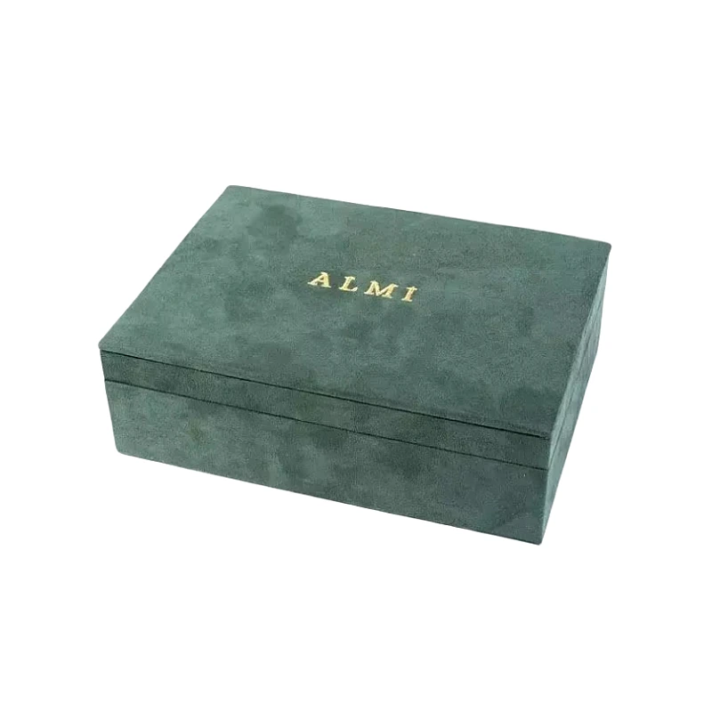
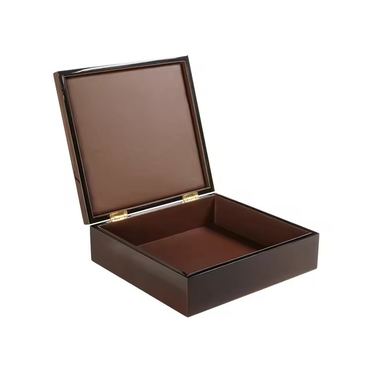
A consistência da cor não é apenas um pormenor - é uma promessa de qualidade. Na produção de caixas de relógios de luxo, mesmo uma ligeira variação de tom pode quebrar essa promessa.
Para construir o reconhecimento da marca e a confiança do cliente, cada produção de uma caixa de relógio deve corresponder exatamente à anterior.
Após anos a ajudar os clientes a criar embalagens de alta qualidade consistentes, aprendi que a combinação perfeita de cores é parte arte, parte ciência e sempre inegociável. Eis como o fazemos.
Porque é que uma correspondência de cores consistente é essencial para uma marca de produto a longo prazo?
As marcas de luxo confiam na cor como parte da sua identidade. Se a sua caixa de relógio manchada de nogueira de um lote for diferente da de outro, toda a imagem da marca parece inconsistente.
A consistência da cor afecta:
- Integridade do produto: Os compradores esperam que as encomendas repetidas tenham o mesmo aspeto
- Coesão de marketing: A embalagem deve corresponder a todos os tamanhos e SKUs
- Visual merchandising: A exposição e a apresentação a retalho dependem da uniformidade de tons
- Perceção do cliente: Uma cor inconsistente sugere um controlo de baixa qualidade
| Impacto da correspondência de cores | Resultado |
|---|---|
| Tons perfeitamente combinados | Coesão da marca, confiança visual |
| Ligeiro desvio de cor | Incoerência percebida |
| Grande desfasamento | Pedidos de devolução, perda de credibilidade |
Já tive clientes que nos voltaram a contactar anos mais tarde, pedindo novas encomendas que correspondiam a uma caixa de relógio com 3 anos. Eles esperam a mesma cor. Nós planeamos isso desde o primeiro dia.
Que factores podem levar a ligeiras variações de cor em séries de produção repetidas?
Mesmo que esteja a utilizar a mesma fórmula de corante, a cor pode mudar devido a muitas variáveis subtis no processamento da madeira, no acabamento ou nas condições ambientais.
Principais fontes de variação:
- Diferenças entre lotes de espécies de madeira1: Mesmo da mesma árvore, o grão e o tom variam
- Teor de humidade e taxa de absorção2 afectam a forma como a madeira recebe o verniz
- Erros de mistura ou de medição de manchas3 da preparação manual
- Envelhecimento ou amarelecimento da laca ao longo do tempo
- Tempo de cura e diferenças de temperatura durante a secagem
- Iluminação ambiente durante a inspeção desorienta o julgamento visual
| Variável | Risk It Introduz |
|---|---|
| Cor de madeira natural | Ligeiras mudanças de tom vermelho/amarelo |
| Taxa de impregnação de manchas | Manchas mais claras ou mais escuras |
| Verniz inconsistente | Variação do brilho ou do tom |
Uma vez, recebemos um novo lote de folheado de nogueira com tons ligeiramente mais frios. Sem ajustar a mistura de corantes, todo o lote parecia "estranho" em comparação com a nossa amostra aprovada.
Como é que as amostras de cor, as amostras ou os painéis principais são utilizados como referência?
Não se pode gerir o que não se pode medir - e no controlo da cor, isso significa trabalhar com referências físicas.
Ferramentas que utilizamos:
- Painel de cores principal4: Um painel acabado em tamanho real (mesma madeira, corante e acabamento) armazenado numa área controlada
- Amostras de produção5: Pequenas peças de folheado acabadas a par de cada lote e arquivadas
- Amostras aprovadas pelo cliente6: Unidades de referência assinadas pelo cliente e conservadas para comparação
| Tipo de referência | Utilizado para |
|---|---|
| Painel de cores principal | Correspondência de lotes de produção completos |
| Pequenas amostras de azulejos | Controlo pontual da consistência da mancha |
| Amostra da caixa anterior | Verificação da continuidade visual |
Guardar sempre os painéis principais ao abrigo da luz e da humidade
Substituir os painéis principais a cada 12-24 meses se o acabamento ficar amarelo ou desbotado
Nas nossas instalações, cada acabamento de caixa de relógio recebe um painel principal etiquetado com o código da fórmula, a data e o nome do cliente. Nenhum lote é enviado sem uma correspondência lado a lado.
Que papel desempenha a iluminação controlada na inspeção precisa da cor?
A iluminação muda tudo. O que parece quente sob luz amarela pode tornar-se cinzento sob luz fria. A verificação da cor deve ser efectuada num ambiente neutro e normalizado.
Melhores práticas:
- Utilização Lâmpadas de luz do dia D65 (6500K)7 para correspondência de cores
- Evitar iluminação fluorescente ou de tungsténio quente que distorce o tom
- Verificar em várias condições de iluminação se a embalagem será vendida a nível mundial
- Utilizar um cabina de cor8 (caixa de luz) com interior cinzento neutro para os controlos finais
| Tipo de iluminação | Qualidade do julgamento da cor |
|---|---|
| Luz padrão D65 | Alta (reprodução de cores reais) |
| Fluorescente de escritório | Médio (frequentemente demasiado frio) |
| Luz solar natural | Variável (a hora do dia é importante) |
Inspecionar sempre à mesma hora do dia e sob a mesma luz
Registar as condições de iluminação da inspeção nos documentos de CQ
Já tivemos clientes que viram caixas sob as luzes da sua boutique e pensaram que a cor estava errada - até as verem sob uma iluminação D65 adequada, como a que utilizamos durante a produção.
Como é que se normalizam as fórmulas de corantes, acabamentos e vernizes para evitar alterações?
A consistência começa com uma gestão precisa da fórmula. Na nossa oficina, nada é misturado a olho nu - utilizamos proporções exactas de peso e volume para cada componente de cor.
Protocolo de controlo de cor:
- Utilização balanças digitais9 para mistura de pigmentos e corantes
- Etiquetar cada lote com a data e o código da fórmula
- Armazenar fórmulas numa base de dados centralizada (não apenas notas escritas à mão)
- Misturar os frascos de amostra para cada lote de coloração para confirmação visual
- Aplicar amostras de teste antes da execução completa
| Etapa do processo | Objetivo |
|---|---|
| Codificação de fórmulas | Ligações de acabamento para a amostra principal |
| Ensaio de lotes de manchas | Confirma a cor antes da aplicação |
| Painel de ensaio de pulverização | Assegura a correspondência da tonalidade da laca |
Não se baseie apenas na proporção do pigmento - ajuste para a absorção da madeira e a direção do veio
Acabar sempre os painéis de teste com a pilha completa de revestimentos (corante + vedante + verniz)
Utilizamos colorímetros10 para digitalizar painéis acabados para obter dados de cor numéricos. Isto dá-nos leituras mensuráveis - e não apenas o julgamento humano - para que possamos fazer corresponder os acabamentos mesmo anos mais tarde.
Que documentação e processos de controlo de qualidade suportam uma reprodução de cores fiável?
As boas cores resultam de bons registos. Todas as encomendas repetidas bem sucedidas começam com documentação que regista materiais, métodos e resultados.
Principais ferramentas de controlo de qualidade:
- Folha de correspondência de cores11: Regista a fórmula do pigmento, o código do lote, o tipo de substrato e a iluminação utilizada
- Diário de produção12: Anota o operador, o tempo de pulverização, a duração da cura e eventuais ajustamentos
- Lista de controlo visual QC13: Confirma que o nível de cor, laca e brilho corresponde ao painel principal
- Digitalizações a cores digitais (se utilizadas): Lab* ou valores RGB guardados com o ficheiro de lote
| Tipo de documento | Porque é que é importante |
|---|---|
| Registos de correspondência de cores | Permite a consistência a longo prazo |
| Amostra aprovada pelo cliente | Serve de referência jurídica visual |
| Registo do desvio da produção | Evita a repetição de erros |
Manter as amostras de clientes assinadas juntamente com os painéis internos de controlo de qualidade
Verificar novamente cada novo lote em relação aos padrões visuais e digitais
Um cliente europeu pediu-nos uma vez para refazer 200 caixas porque o tom era "ligeiramente diferente". Os nossos registos mostraram que a sua nova amostra era a variação - não a nossa produção. A nossa documentação evitou-nos uma devolução dispendiosa.
Conclusão
A correspondência de cores não é apenas técnica - é fundamental para a identidade da marca, a integridade do produto e a confiança do cliente.
Para garantir a consistência da cor em todos os lotes de caixas de relógio:
- Utilizar os painéis principais e as amostras arquivadas como referências visuais não negociáveis
- Normalizar as colorações e os acabamentos com fórmulas e registos precisos
- Combinar sob iluminação D65 controlada - sempre
- Utilizar a documentação e os testes para detetar variações antes do envio
Porque no mundo do luxo, os seus clientes não se esquecem do aspeto e do toque de uma caixa da primeira vez - e esperam que tenha exatamente o mesmo aspeto da próxima vez.
Nome da marca: WoodoBox
Slogan: Caixas de madeira personalizadas, fabricadas na perfeição
Sítio Web: www.woodobox.com
-
Compreender as diferenças de lote das espécies de madeira pode ajudá-lo a antecipar e gerir as variações de cor nos seus projectos. ↩
-
A exploração deste tópico fornecerá informações sobre o impacto da humidade na aplicação do corante e nos resultados finais da cor. ↩
-
Conhecer estes erros pode ajudar a melhorar o seu processo de acabamento e a obter resultados de cor consistentes. ↩
-
Compreender os Painéis de Cores Principais é crucial para uma gestão eficaz da cor e para garantir a consistência na produção. ↩
-
Explorar o papel das amostras de produção pode melhorar o seu conhecimento da consistência da cor e do controlo de qualidade no fabrico. ↩
-
Aprender sobre Amostras Aprovadas pelo Cliente pode ajudá-lo a compreender a importância do feedback do cliente no processo de produção. ↩
-
Compreender as lâmpadas de luz do dia D65 é crucial para uma correspondência de cores precisa, garantindo uma verdadeira reprodução de cores em vários ambientes. ↩
-
Uma cabina de cor proporciona um ambiente controlado para verificações finais de cor, essenciais para manter a precisão da cor na produção. ↩
-
As balanças digitais são cruciais para a precisão na mistura, assegurando que as suas fórmulas são sempre consistentes e fiáveis. ↩
-
A exploração de colorímetros pode fornecer informações sobre técnicas avançadas de correspondência de cores, melhorando significativamente a qualidade do seu acabamento. ↩
-
A compreensão da folha de correspondência de cores pode melhorar a consistência da cor e os processos de controlo de qualidade. ↩
-
Explorar a função de um diário de produção pode ajudá-lo a otimizar os seus processos de produção e a evitar erros. ↩
-
Conhecer a lista de verificação do controlo de qualidade visual pode melhorar as suas práticas de controlo de qualidade e garantir a precisão das cores. ↩