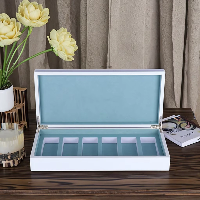
P: Many luxury perfume boxes look expensive at first glance, but few truly feel unforgettable.
A: Visual sameness weakens brand memory and reduces perceived value.
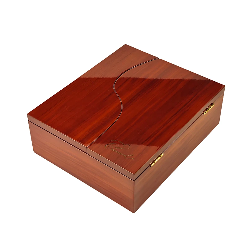
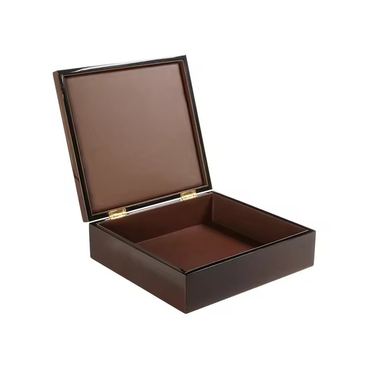
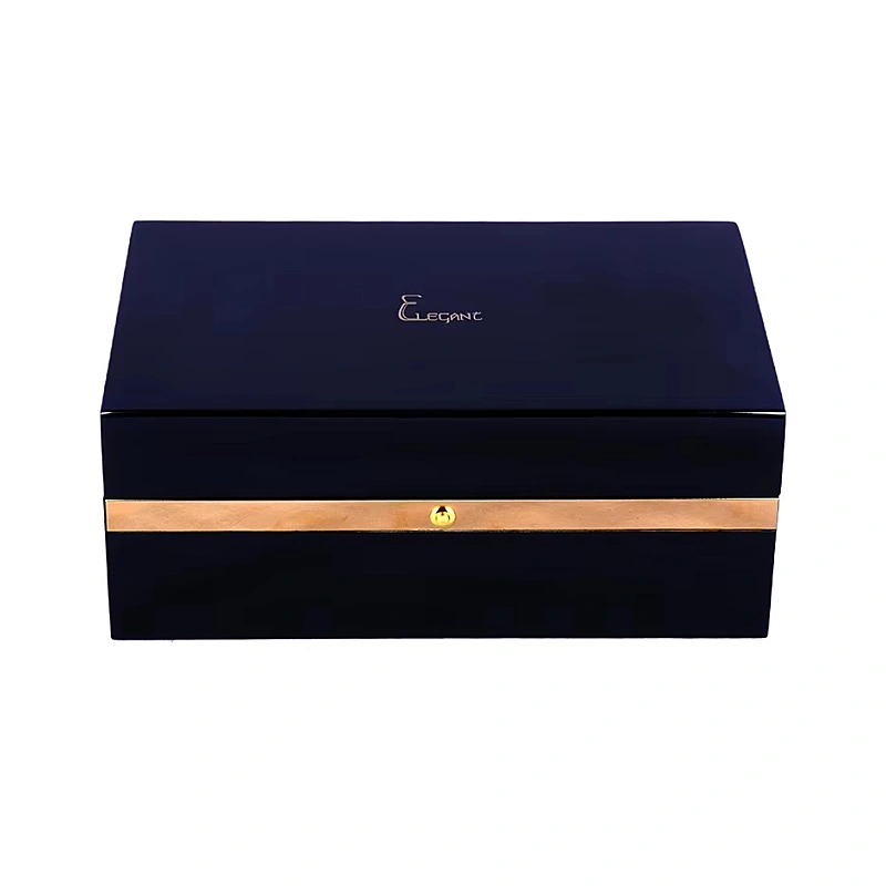
S: Piano-lacquer finishing breaks this pattern by creating instant visual impact and emotional depth.
Piano-lacquer finishing transforms a perfume box by adding depth, precision, and reflective drama that immediately signals ultra-luxury and flawless craftsmanship.
I have worked with luxury wooden perfume boxes for over fifteen years. I have seen how surface finishing alone can change how a product is judged, touched, and remembered. Piano lacquer is not decoration. It is a visual language.
Why does piano-lacquer create a sense of depth and visual drama instantly?
Flat finishes often make even well-designed boxes feel ordinary.
Our eyes quickly scan them and move on.
This creates a problem for premium perfume brands that rely on first impressions.
Piano-lacquer creates visual depth by layering ultra-thin coats that reflect light inward, making color appear deeper, richer, and almost three-dimensional.
When I first introduced piano-lacquer finishing into perfume box production, the reaction from clients was immediate. The same box structure suddenly felt heavier, calmer, and more valuable. Nothing else changed. Only the surface.
How layered lacquer builds visual depth
Piano lacquer is never a single coating.
It is a process.
- Base sealing
- Multiple color coats
- Repeated polishing between layers
- Final mirror polishing
Each layer adds optical depth. Light does not stop at the surface. It travels through layers and reflects back.
This is why piano-lacquer black looks deeper than matte black.
This is why red feels darker and more emotional.
Depth versus flatness
| Tipo di finitura | Visual Depth | Impatto emotivo |
|---|---|---|
| Vernice opaca | Basso | Calm, soft |
| Semi-lucido | Medio | Clean, safe |
| Lacca per pianoforte | Molto alto | Dramatic, intense |
From my experience, customers cannot explain this difference clearly. But they feel it immediately. They often say the box looks “alive” or “liquid-like.”
Why depth equals drama
Luxury perfume is not only about scent.
It is about mood.
Depth creates mystery.
Mystery creates desire.
Piano lacquer gives even simple box shapes a cinematic presence. This is why it works so well for statement fragrances and bold brand positioning.
How does a mirror-like surface elevate perceived precision and craftsmanship?
Many finishes hide mistakes.
Piano lacquer exposes everything.
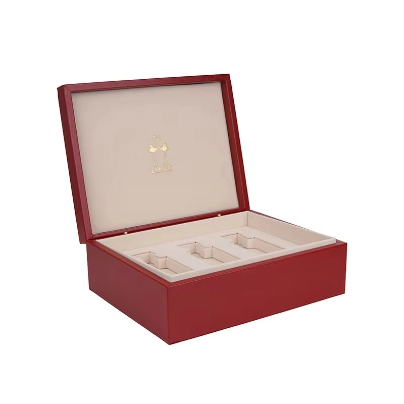
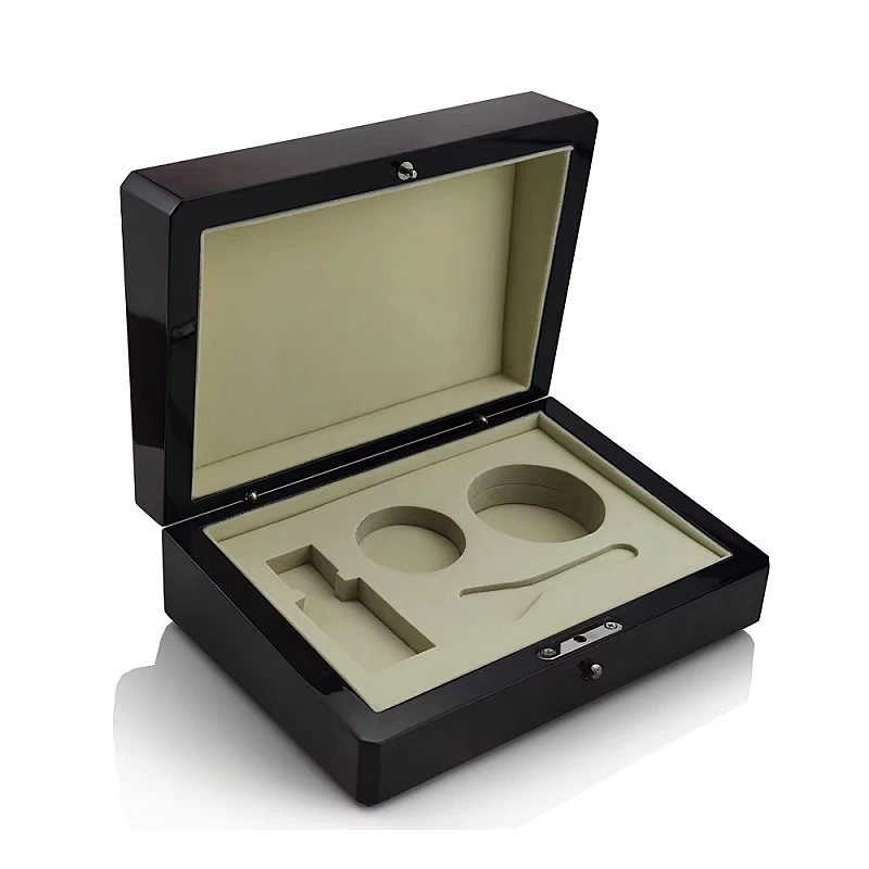
A mirror-like piano-lacquer surface signals extreme precision because it reveals every joint, edge, and alignment without mercy.
This is why I always tell clients: piano lacquer is not a finish you “try.”
It is a finish you earn.
Why piano lacquer is unforgiving
Any flaw becomes visible:
- Uneven sanding
- Misaligned panels
- Inaccurate corners
- Contaminazione da polvere
Under gloss reflection, these defects cannot hide.
This is why piano-lacquer boxes must start with perfect structure.
Craftsmanship begins before finishing
In my factory, piano-lacquer projects take longer even before painting starts.
Key preparation steps include:
- Extra sanding cycles
- Edge rounding control
- Structure reinforcement
- Moisture balance checks
Only then can lacquer work correctly.
What customers subconsciously read
Customers may not say “this box has tight tolerances.”
Instead, they say:
- “This feels flawless”
- “This looks museum-grade”
- “This feels like jewelry”
These reactions are not accidents.
They are psychological responses to visible precision.
Precision as a luxury signal
| Segnale visivo | Customer Interpretation |
|---|---|
| Sharp reflection | Precisione |
| Bordi puliti | Control |
| No distortion | Skill |
In luxury packaging, perfection does not need explanation.
The surface speaks first.
Many brands want to look luxurious.
Few want to carry luxury cost and risk.
Piano-lacquer is linked to ultra-luxury because it requires time, skill, rejection tolerance, and cultural patience that mass production cannot support.
This finish is expensive for a reason.
Time is the real cost
Piano-lacquer finishing cannot be rushed.
- Each layer needs curing time
- Polishing requires skilled hands
- Rework rates are higher
Mass premium relies on speed.
Piano lacquer relies on restraint.
High rejection tolerance
During production, many boxes fail quality checks.
Common rejection causes:
- Micro dust
- Surface waves
- Incoerenza del colore
- Edge reflection distortion
Brands choosing piano lacquer accept this reality.
This acceptance itself is a luxury mindset.
Cultural luxury references
Piano lacquer carries historical weight:
- Grand pianos
- Classical instruments
- Asian lacquerware
- Bespoke furniture
These objects share common traits:
- Longevità
- Care
- Respect for material
When used on perfume boxes, these associations transfer quietly.
Ultra-luxury versus premium perception
| Categoria | Typical Finish | Messaggio emozionale |
|---|---|---|
| Mass premium | Spray gloss | Clean, modern |
| Accessible luxury | Soft-touch | Comodo |
| Ultra-lusso | Lacca per pianoforte | Serious, permanent |
This is why piano-lacquer boxes feel less trendy and more timeless.
How does high-gloss finishing change how light, color, and form are perceived?
Light changes everything.
Gloss controls light.
High-gloss piano lacquer reflects light sharply, making colors stronger, edges clearer, and forms more architectural.
This effect is especially powerful in retail environments.
Light behavior comparison
| Finitura | Light Interaction | Risultato visivo |
|---|---|---|
| Opaco | Absorbs light | Soft, quiet |
| Raso | Diffuses light | Equilibrato |
| Lacca per pianoforte | Reflects light | Sharp, bold |
Under spotlights, piano-lacquer boxes stand out immediately.
Color amplification
Gloss intensifies pigment.
- Black looks deeper
- White looks purer
- Dark colors gain drama
This is why many luxury perfume boxes use limited color palettes when paired with piano lacquer. Too many colors compete with reflection.
Form enhancement
Reflection makes edges clearer.
Even simple rectangular boxes appear more complex.
This is critical for minimalist brands.
Piano lacquer gives them visual power without extra decoration.
Retail shelf impact
In controlled lighting:
- Gloss creates contrast
- Contrast draws attention
- Attention increases perceived value
This is why piano-lacquer boxes perform well in:
- Duty-free shops
- High-end boutiques
- Gift displays
When does piano-lacquer enhance a perfume brand—and when can it overpower it?
Power always needs control.
Piano-lacquer enhances a perfume brand when it aligns with intensity, precision, and confidence, but it can overpower brands built on softness or natural storytelling.
I have seen both outcomes.
When piano lacquer works best
From my experience, it fits well with:
- High-concentration perfumes
- Edizioni limitate
- Collector releases
- Modern luxury brands
These products benefit from visual authority.
When it can fail
It may feel wrong for:
- Organic fragrances
- Nature-inspired stories
- Handmade narratives
- Emotional softness
In these cases, piano lacquer feels cold or distant.
Balance strategies I often recommend
- Minimal logos
- Incisione sottile
- Controlled color use
- Interior contrast with fabric or wood grain
Finish-to-brand alignment table
| Brand Story | Finish Result |
|---|---|
| Precision-driven | Strong match |
| Heritage luxury | Excellent fit |
| Emotional artisan | Rischioso |
| Natural wellness | Poor fit |
Luxury is not about the most expensive finish.
It is about the right finish.
Conclusione
Piano-lacquer finishing turns a perfume box into a visual statement of perfection, depth, and control. When aligned with the right brand story, it elevates desire before the box is opened.
WoodoBox
Scatole di legno personalizzate, realizzate alla perfezione