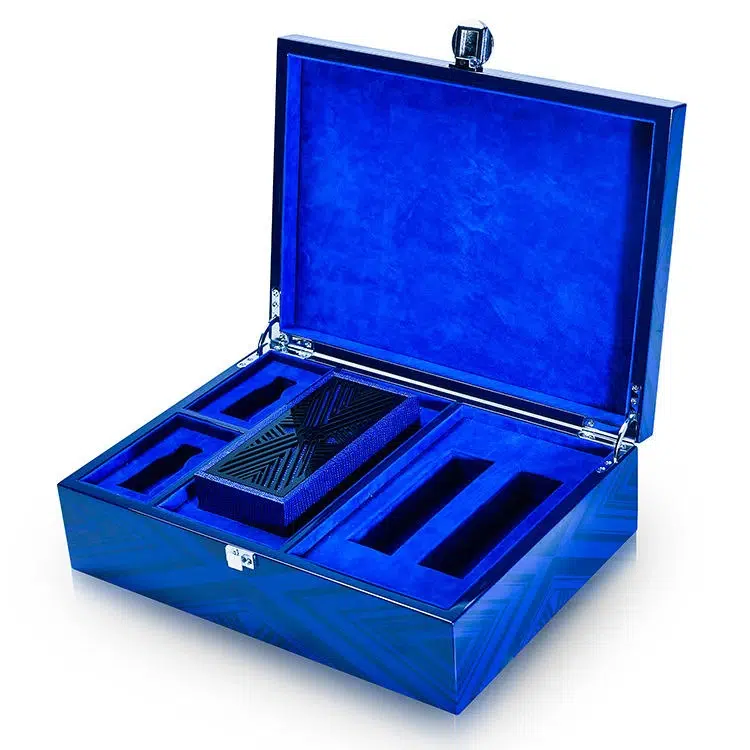

Color consistency isn't just a detail—it’s a promise of quality. In luxury watch box production, even a slight variation in tone can break that promise.
To build brand recognition and customer trust, every production run of a watch box must match the previous one—exactly.
After years of helping clients build consistent high-end packaging, I’ve learned that perfect color matching is part art, part science, and always non-negotiable. Here’s how we do it.
Why is consistent color matching essential for long-term product branding?
Luxury brands rely on color as part of their identity. If your walnut-stained watch box from one batch looks different from the next, the entire brand image feels inconsistent.
Color consistency affects:
- Product integrity: Buyers expect repeat orders to look the same
- Marketing cohesion: Packaging across sizes and SKUs must match
- Visual merchandising: Display and retail presentation rely on tone uniformity
- Customer perception: Inconsistent color suggests low-quality control
| Color Matching Impact | Risultato |
|---|---|
| Perfectly matched tones | Brand cohesion, visual trust |
| Slight color deviation | Perceived inconsistency |
| Major mismatch | Return requests, lost credibility |
I’ve had clients return to us years later asking for reorders that match a 3-year-old watch box. They expect the same color. We plan for that from day one.
What factors can lead to slight color variations in repeated production runs?
Even if you're using the same stain formula, color can shift due to many subtle variables in wood processing, finishing, or environmental conditions.
Main Sources of Variation:
- Wood species batch differences1: Even from the same tree, grain and tone vary
- Moisture content and absorption rate2 affect how wood takes stain
- Stain mixing or measurement errors3 from manual preparation
- Lacquer aging or yellowing nel tempo
- Curing time and temperature differences during drying
- Ambient lighting during inspection misguides visual judgment
| Variabile | Risk It Introduces |
|---|---|
| Natural wood color | Slight red/yellow tone shifts |
| Stain soak rate | Lighter or darker patches |
| Inconsistent lacquer | Gloss or tone variation |
One time, we received a new lot of walnut veneer with slightly cooler undertones. Without adjusting the stain mix, the whole run looked “off” compared to our approved sample.
How are color samples, swatches, or master panels used for reference?
You can’t manage what you can’t measure—and in color control, that means working with physical master references.
Tools We Use:
- Master Color Panel4: A full-size finished panel (same wood, stain, and finish) stored in a controlled area
- Production Swatches5: Small veneer pieces finished alongside each batch and archived
- Client-Approved Samples6: Reference units signed off by client and kept for comparison
| Reference Type | Usato per |
|---|---|
| Master Color Panel | Matching full production batches |
| Small swatch tiles | Spot checking stain consistency |
| Previous box sample | Verifying visual continuity |
✔ Always store master panels away from light and humidity
✔ Replace master panels every 12–24 months if finish yellows or fades
In our facility, every watch box finish gets a master panel labeled with formula code, date, and client name. No batch goes out without side-by-side matching.
What role does controlled lighting play in accurate color inspection?
Lighting changes everything. What looks warm under yellow light might turn grey under cool light. Color checking must happen in a neutral, standardized environment.
Le migliori pratiche:
- Utilizzo D65 daylight lamps (6500K)7 for color matching
- Avoid fluorescent or warm tungsten lighting which distorts tone
- Check under multiple lighting conditions if packaging will be sold globally
- Utilizzare un color booth8 (light box) with neutral gray interior for final checks
| Lighting Type | Color Judgment Quality |
|---|---|
| D65 Standard Light | High (true color rendering) |
| Office Fluorescent | Medium (often too cool) |
| Natural Sunlight | Variable (time of day matters) |
✔ Always inspect during the same time of day and under the same light
✔ Record inspection lighting conditions in QC documents
We've had clients who saw boxes under their boutique lights and thought the color was wrong—until they viewed them under proper D65 lighting like we use during production.
How do you standardize stains, finishes, and lacquer formulas to avoid shifts?
Consistency starts with precise formula management. In our workshop, nothing is mixed by eye—we use exact weight and volume ratios for every color component.
Color Control Protocol:
- Utilizzo digital scales9 for pigment and stain mixing
- Label every batch with date and formula code
- Store formulas in a centralized database (not just handwritten notes)
- Mix sample jars for each stain batch for visual confirmation
- Apply test swatches before full run
| Process Step | Scopo |
|---|---|
| Formula coding | Links finish to master sample |
| Stain batch testing | Confirms color before application |
| Spray test panel | Ensures lacquer tone matches |
✔ Don’t rely solely on pigment ratio—adjust for wood absorption and grain direction
✔ Always finish test panels with full coating stack (stain + sealer + lacquer)
We use colorimeters10 to scan finished panels for numeric color data. This gives us measurable readings—not just human judgment—so we can match finishes even years later.
What documentation and quality control processes support reliable color reproduction?
Good color comes from good records. Every successful repeat order starts with documentation that tracks materials, methods, and outcomes.
Key QC Tools:
- Color Matching Sheet11: Records pigment formula, batch code, substrate type, and lighting used
- Production Logbook12: Notes operator, spray time, curing duration, and any adjustments
- Visual QC Checklist13: Confirms stain, lacquer, and gloss level match master panel
- Digital Color Scans (if used): Lab* or RGB values saved with batch file
| Document Type | Perché è importante |
|---|---|
| Color matching records | Enables long-term consistency |
| Client-approved sample | Serves as visual legal reference |
| Production deviation log | Prevents repeated mistakes |
✔ Keep signed client samples alongside internal QC panels
✔ Recheck every new batch against both visual and digital standards
A European client once asked us to remake 200 boxes because the tone was “slightly different.” Our records showed their new sample was the variation—not our production. Our documentation saved us a costly return.
Conclusione
Color matching isn’t just technical—it’s foundational to brand identity, product integrity, and customer trust.
To ensure color consistency across watch box batches:
- Use master panels and archived swatches as non-negotiable visual references
- Standardize stains and finishes with precise formulas and records
- Match under controlled D65 lighting—every time
- Use documentation and testing to catch variation before it ships
Because in the luxury world, your customers don’t forget how a box looked and felt the first time—and they’ll expect it to look exactly the same the next time.
Nome del marchio: WoodoBox
Slogan: Scatole di legno personalizzate, realizzate alla perfezione
Sito web: www.woodobox.com
-
Understanding wood species batch differences can help you anticipate and manage color variations in your projects. ↩
-
Exploring this topic will provide insights into how moisture impacts stain application and final color results. ↩
-
Learning about these errors can help improve your finishing process and achieve consistent color results. ↩
-
Understanding Master Color Panels is crucial for effective color management and ensuring consistency in production. ↩
-
Exploring the role of Production Swatches can enhance your knowledge of color consistency and quality control in manufacturing. ↩
-
Learning about Client-Approved Samples can help you grasp the significance of client feedback in the production process. ↩
-
Understanding D65 daylight lamps is crucial for accurate color matching, ensuring true color rendering in various environments. ↩
-
A color booth provides a controlled environment for final color checks, essential for maintaining color accuracy in production. ↩
-
Digital scales are crucial for precision in mixing, ensuring that your formulas are consistent and reliable every time. ↩
-
Exploring colorimeters can provide insights into advanced color matching techniques, improving your finish quality significantly. ↩
-
Understanding the Color Matching Sheet can enhance your color consistency and quality control processes. ↩
-
Exploring the role of a Production Logbook can help you streamline your production processes and avoid mistakes. ↩
-
Learning about the Visual QC Checklist can improve your quality assurance practices and ensure color accuracy. ↩