En los envases de lujo, la textura de la superficie y la fluidez visual son tan importantes como los materiales. La dirección de las vetas de la madera en una caja de regalo chapada puede transformarla de estándar a impresionante.
La dirección del grano no es sólo un detalle técnico: es una decisión de diseño que define la elegancia y la armonía visual de la caja.
Después de años produciendo cajas de regalo personalizadas para marcas de primera calidad, he aprendido que dominar la dirección del grano es una de las formas más poderosas (aunque ignorada) de elevar el valor percibido. Así es como lo hacemos.
¿Por qué importa la dirección del veteado en el diseño de cajas de regalo chapadas de alta gama?
La dirección de la veta se refiere a la orientación de las fibras de madera en la superficie visible de la chapa. Su alineación influye en el reflejo de la luz, la apariencia de las juntas y el tacto refinado de la superficie.
En diseño de cajas de lujo1La disposición de los granos tiene tres objetivos:
- Flujo visual: Crea continuidad entre los paneles
- Simetría: Mejora la formalidad y el equilibrio
- Atractivo táctil: Guía el ojo y la mano del usuario a través de la caja
| Aspecto del diseño | Papel de la dirección del grano |
|---|---|
| Paneles de tapa y base | Reforzar la geometría vertical u horizontal |
| Esquinas y bordes | Alineación de costuras y consistencia táctil |
| Cara frontal | Primera impresión y simetría |
He visto cajas de artesanía perfecta perder su atractivo visual simplemente porque la veta iba en la dirección equivocada. Los ojos -y las manos- se dan cuenta de estas cosas.
¿Cómo afecta la disposición vertical u horizontal del grano al equilibrio visual y la elegancia?
La orientación del grano -vertical u horizontal- puede cambiar drásticamente la sensación que transmite una caja y cómo se percibe la marca.
Grano vertical
- Sugiere altura, estructura, formalidad
- Funciona bien para cajas altas o verticales
- Común en envases clásicos de relojes, joyas y perfumes
Grano horizontal
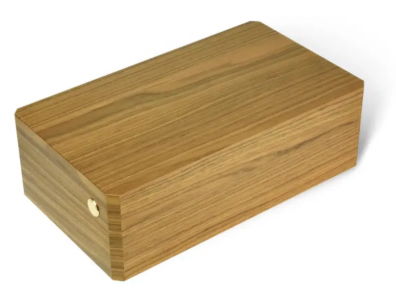
- Implica amplitud, estabilidad, relajación
- Ideal para cajas más planas o envases tipo cajón
- A menudo se utiliza en marcas masculinas, minimalistas o modernas.
| Orientación del grano | Efecto de diseño | El mejor caso de uso |
|---|---|---|
| Vertical | Formal, elegante, ascendente | Cajas de regalo de pie, frascos de perfume |
| Horizontal | Cimentado, moderno, tranquilo | Cajas tipo cajón, diseños de sobremesa |
✔ Uso grano vertical2 para el drama y la altura
✔ Uso grano horizontal3 para la calma y el equilibrio
Para un cliente reciente, diseñamos dos líneas: nogal de grano vertical para su serie de perfumes y fresno horizontal para los kits de aseo masculino. Cada grano contaba una historia diferente.
¿Qué es el grano cruzado4 aplicación, y cuándo se utiliza para contraste estético5?
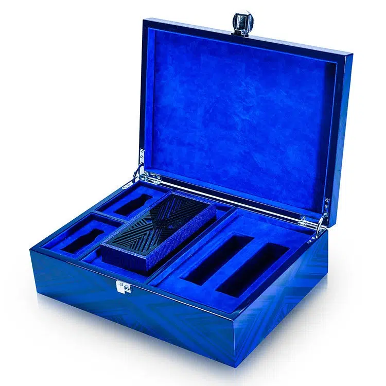
La granulación cruzada se refiere a la aplicación de chapa6 en un ángulo de 90 grados respecto a los paneles adyacentes. Crea un sutil pero lujoso contraste entre superficies, bordes o tapas.
Usos del grano cruzado:
- Contraste entre tapa y base para la separación visual
- Forro interior de la tapa en grano contrastado
- Frente de cajón sobresaliendo por los lados
- Encuadre de bordes utilizando la dirección perpendicular del grano
| Técnica | Resultado visual |
|---|---|
| Contraste tapa/base | Hace hincapié en la mecánica de apertura |
| Encuadre de bordes | Destaca la precisión de construcción |
| Detalles de los cajones | Añade textura y profundidad |
✔ Funciona mejor con especies de grano uniforme como el arce, el roble o el nogal.
✔ También se puede realzar la veta cruzada cambiando el nivel de brillo (por ejemplo, tapa mate sobre base satinada).
Una vez hicimos una caja de coleccionista con vetas horizontales en el panel frontal y verticales en la tapa. Daba a la pieza una sutil sofisticación sin llamar la atención.
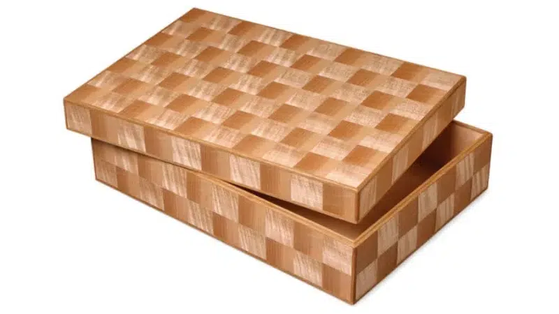
¿Cómo pueden las vetas radiales o diagonales añadir una sensación de movimiento y singularidad?
Los patrones diagonales, radiales o incluso de chevron pueden convertir la superficie de una caja en una obra de arte, sobre todo si se trabaja con chapas de madera labrada.
Patrones de granos especiales:
- Radial (sunburst)7: El grano se abre en abanico desde un punto central
- Diagonal8: El grano corre a 30-45 grados fuera del eje
- Chevron o espiga9: Espejo en forma de V con chapa de madera a juego
Requieren técnicas avanzadas de chapado, pero ofrecen una elegancia inigualable.
| Tipo de patrón | Tono emocional | Uso ideal |
|---|---|---|
| Radial | Dinámico, radiante | Tapas centradas, tapas medallón |
| Diagonal | Artístico, moderno | Joyeros o puros contemporáneos |
| Chevron | Tradicional, ornamentado | Ediciones limitadas o colecciones heredadas |
Utilice chapas con figuras como el fresno tamo, el arce fiddleback o la caoba crotch para conseguir efectos espectaculares.
✔ Equilibra atrevidos patrones de grano con formas de caja limpias y minimalistas.
Nuestra tapa sunburst para una marca de vinos de lujo se convirtió en el centro de toda su campaña. El veteado radial captaba la luz de forma diferente en cada ángulo, como una piedra preciosa.
¿Cuáles son los retos de alinear la dirección del grano en múltiples componentes de la caja?
En consistencia del grano10 a través de paneles, tapas, bordes y cajones requiere precisión... y experiencia.
Desafíos comunes:
- Desalineación del panel debido a la deformación del material o a la inexactitud del corte de la sierra
- Errores de secuencia de las chapas de madera
- Voltear la dirección (por ejemplo, grano que fluye hacia arriba en la tapa y hacia abajo en la base)
- Expansión del pegamento provocando el desplazamiento de las costuras del grano durante el prensado
| Componente | Riesgo en caso de desalineación |
|---|---|
| Tapa y base | Rompe el flujo visual |
| Paneles laterales | Desajuste del grano en las esquinas |
| Cara del cajón | Rompe la simetría con el cuerpo |
Soluciones:
- Numerar las hojas de chapa y secuenciarlas antes del corte
- Enchapar siempre primero los componentes más grandes
- Haga coincidir la orientación de los paneles mediante flechas durante el montaje
- Utilizar plantillas o diseños CAD para alinear el grano en cajas de varias piezas
✔ Nunca mezcle lotes de chapa dentro de la misma caja.
✔ Acabado y pulido sólo después de la comprobación de la alineación completa.
Antes del montaje, realizamos una "prueba de alineación del grano" montando en seco todos los paneles sobre una mesa. Son 30 minutos más, pero se evitan costosas repeticiones.
El grano no es sólo decoración: forma parte de la narración. Las marcas de primer nivel utilizan flujo de grano uniforme11 entre colecciones para crear identidad.
La marca a través del grano:
- Coherencia entre tamaños de productos (por ejemplo, grano horizontal en todos los lotes de regalo)
- Identidades materiales específicas (por ejemplo, todas las cajas de perfume utilizan madera de cebra vertical)
- Flujo hacia el embalaje exterior-incluso mangas a juego o gráficos impresos
- Orientación de la firma-siempre vertical, siempre radial, siempre alineado
| Elemento de marca | Técnica granulométrica utilizada |
|---|---|
| Cajas con monograma | Grano Bookmatched detrás del logotipo |
| Series coleccionables | La misma dirección en todas las ediciones |
| Líneas sostenibles | Grano vertical de poro abierto en todos los artículos |
✔ Utilizar mood boards durante la fase de diseño para definir el "grano de la marca"
✔ Registro de proveedores de chapa y secuencias para futuras series de producción.
Para una marca de joyería, conservamos una secuencia de 6 hojas de chapa de nogal labrada, suficiente para crear una continuidad de veteado a lo largo de cinco años de lanzamientos de productos. Eso es planificación de lujo.
Conclusión
La dirección de la veta es una de las herramientas más poderosas, aunque infrautilizada, en el diseño de chapados de lujo. Guía la mirada, refleja los valores de la marca y convierte las superficies cotidianas en experiencias.
Para realzar el atractivo de lujo de las cajas de regalo chapadas:
- Elija intencionadamente la dirección del grano: vertical, horizontal o radial.
- Coincidencia en todas las superficies y componentes visibles
- Utilice el contraste con cuidado para conseguir profundidad visual
- Invierta en una alineación precisa durante la fabricación
- Deje que el flujo de granos cuente la historia de su marca
Porque cuando el grano fluye sin problemas, también lo hace la percepción de calidad de sus clientes.
Marca: WoodoBox
Eslogan: Cajas de madera personalizadas, hechas a la perfección
Página web: www.woodobox.com
-
Explorar el diseño de cajas de lujo puede inspirar su creatividad y ayudarle a crear productos sorprendentes y de gama alta. ↩
-
Descubra cómo el grano vertical realza la elegancia y la estructura del diseño de envases, por lo que resulta ideal para productos de lujo. ↩
-
Descubra los efectos calmantes del grano horizontal en los envases, perfectos para una estética minimalista y moderna. ↩
-
Comprender la aplicación de la veta cruzada puede mejorar sus habilidades para trabajar la madera y sus elecciones estéticas. Explore este enlace para obtener información detallada. ↩
-
Descubra cómo el contraste estético puede elevar sus proyectos de carpintería y crear efectos visuales asombrosos. Este recurso ofrece valiosos consejos de diseño. ↩
-
Conozca las ventajas de la chapa de madera en el trabajo de la madera, incluidos sus beneficios estéticos y funcionales. En este enlace encontrará información completa. ↩
-
Explore cómo los patrones radiales pueden mejorar la estética del diseño y crear efectos visuales dinámicos en sus proyectos. ↩
-
Descubra el impacto de los motivos diagonales en el diseño contemporáneo y cómo pueden aportar un toque artístico a sus creaciones. ↩
-
Conozca las cualidades únicas de los patrones chevron y cómo pueden elevar sus proyectos de carpintería a un nuevo nivel. ↩
-
Comprender la consistencia del veteado es crucial para trabajar la madera con calidad. Explore este recurso para mejorar sus habilidades y evitar errores comunes. ↩
-
Comprender el flujo de grano coherente puede revelar cómo las marcas de lujo mantienen una identidad cohesiva en todas sus colecciones. ↩