A perfume may be expensive, but one wrong packaging decision can quietly ruin first impressions before the bottle is touched.
The perceived value of a perfume gift box drops when materials, structure, details, and experience send signals of cost-cutting instead of intention.
I have seen many premium fragrances lose their impact because the box failed to support the story. If you care about brand value, these mistakes matter more than most people expect.
Choosing the wrong material is the fastest way to make a perfume gift box feel forgettable, even if the fragrance inside is excellent.
When materials do not match the price point, customers immediately lower their expectations.
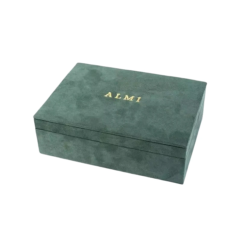
Material sends the first silent message
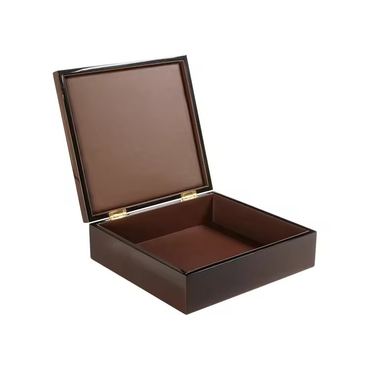
From my experience, customers judge a box before they read a logo. The surface tells them everything. Thin cardboard, plastic trays, or overly glossy paper often feel mass-produced. They do not feel intentional.
Luxury perfume buyers expect resistance when they touch a box. They expect texture. They expect a sense of weight and calm.
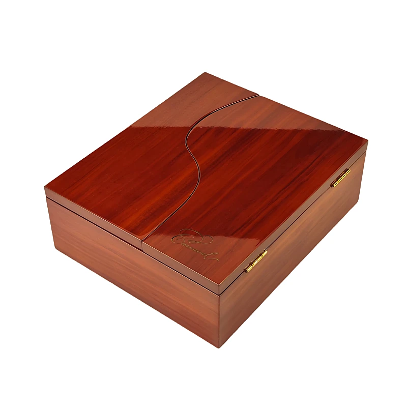
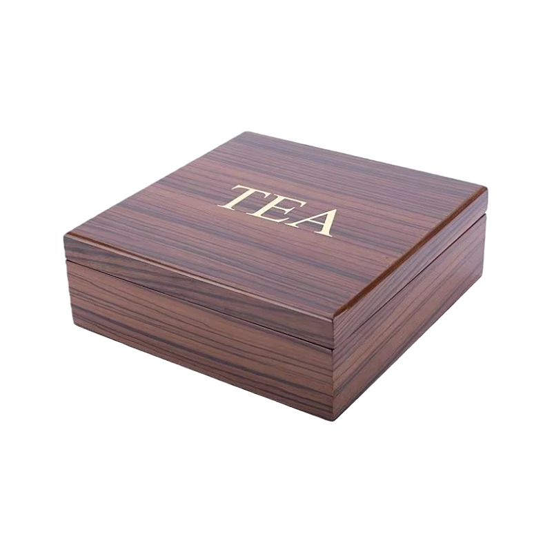
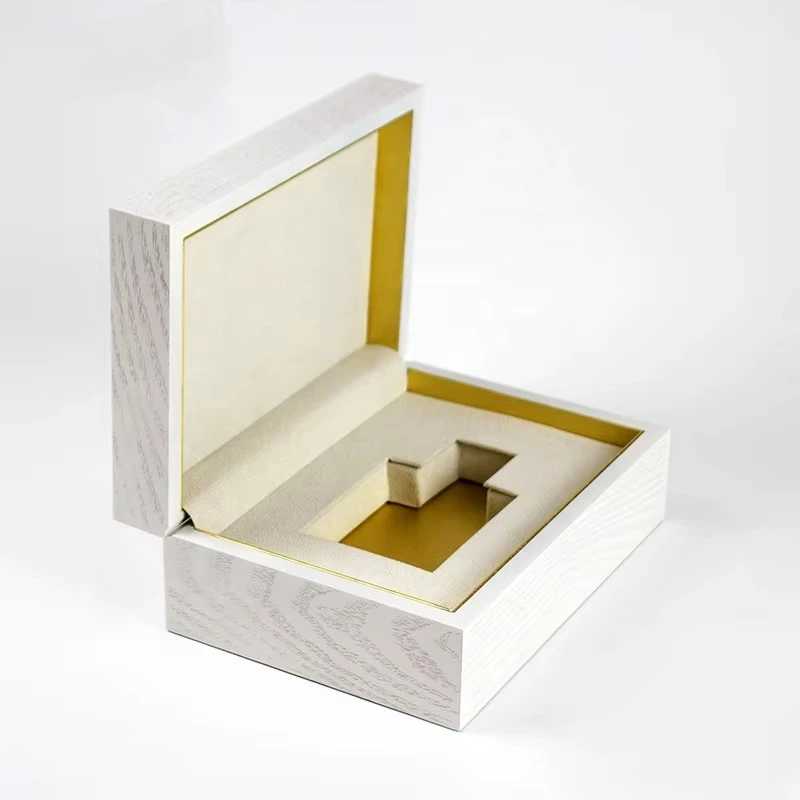
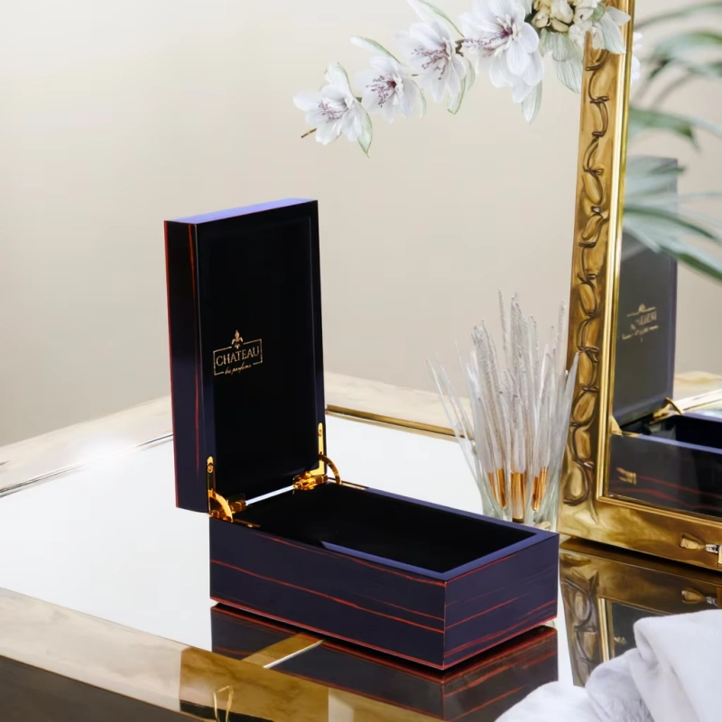
In wooden perfume boxes, the difference is even clearer. Solid wood, MDF with real wood veneer, or high-quality lacquered finishes communicate stability. Cheap substitutes do not.
Common material mistakes I see in real projects
| Wahl des Materials | Why It Hurts Perceived Value |
|---|---|
| Thin cardboard | Feels disposable and short-term |
| Plastic inserts | Suggest cost-saving and fast production |
| Over-glossy paper | Looks decorative but lacks depth |
| Low-density MDF | Feels hollow and weak |
| Fake wood grain | Breaks trust when touched closely |
I once worked with a perfume brand that priced their fragrance above USD 200. They used a rigid paper box with a plastic inner tray. Customers described it as “nice, but normal.” That reaction killed repeat gifting.
Material must match brand positioning
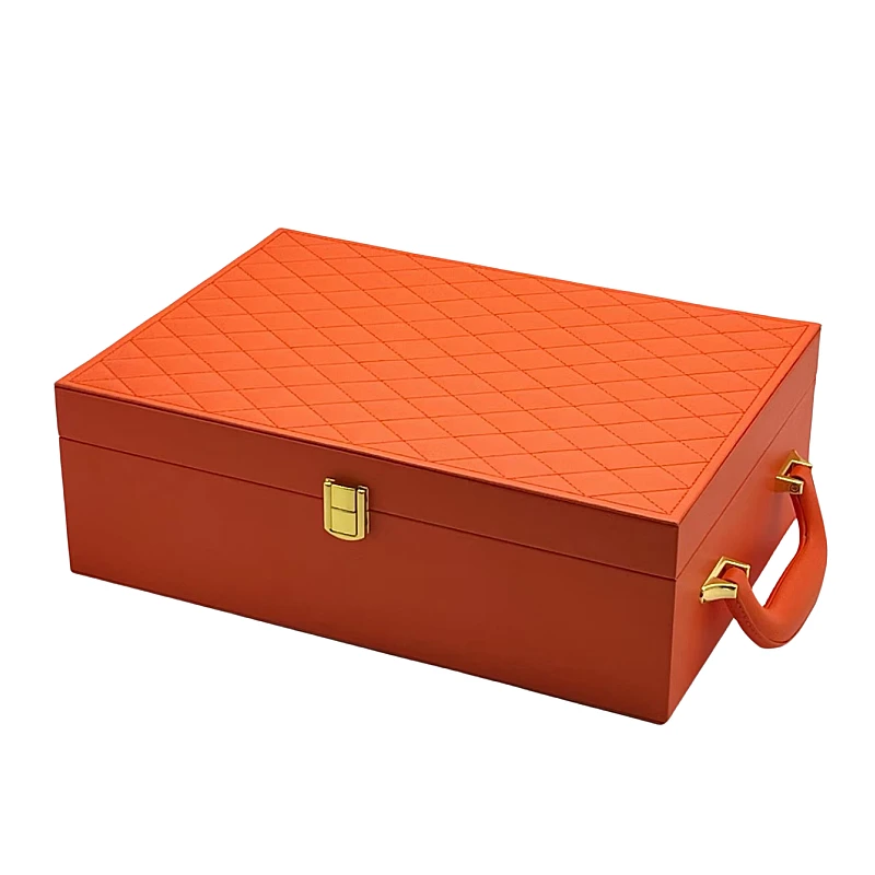
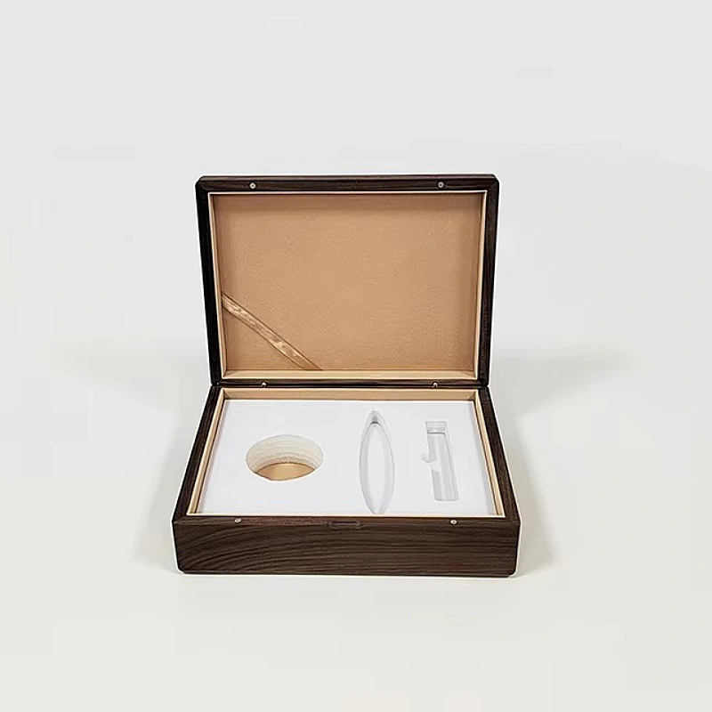
A premium perfume gift box should feel like it belongs in the home after the perfume is gone. That usually means:
- Wooden structures
- Fabric, velvet, or PU leather interiors
- Matte or piano lacquer finishes
- Natural textures with controlled gloss
When the box feels temporary, the perfume also feels temporary. That is the connection buyers make, even if they do not say it out loud.
Why do poor proportions and lightweight structures make gift boxes feel cheap?
A box can look expensive in photos and still feel cheap in real life because of poor structure and wrong proportions.
When a box feels too light or unstable, customers assume corners were cut.
Weight is a psychological signal
In my factory, I often remind clients that weight is not just logistics. It is perception.
A perfume gift box should feel balanced. When someone lifts it, the weight should match the visual promise. If the box looks solid but feels empty, trust breaks instantly.
Lightweight structures create doubt. Customers start questioning the brand’s decisions.
Structural problems I see most often
| Structural Issue | Customer Reaction |
|---|---|
| Lose Deckel | Feels poorly made |
| Schwache Scharniere | Suggests short lifespan |
| Hollow interiors | Creates a cheap echo |
| Dünne Wände | Feels fragile |
| Poor balance | Makes box feel awkward |
Proportion matters more than decoration
Many designers focus on graphics and forget proportion. A box that is too tall, too narrow, or too oversized feels wrong in the hand.
In perfume packaging, good proportion does three things:
- Protects the bottle
- Centers visual attention
- Creates calm during handling
I once adjusted only the wall thickness and lid depth for a client. No design change. Customer feedback improved immediately. They said the box felt “more serious.”
Structure speaks louder than color.
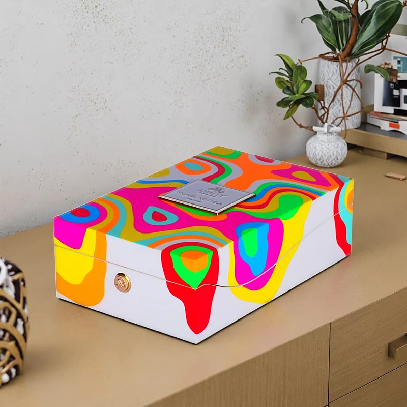
How can overdesign and excessive decoration reduce perceived luxury?
Adding more design elements often reduces luxury instead of increasing it.
When everything is highlighted, nothing feels special.
Luxury prefers restraint
In high-end perfume packaging, silence is powerful. Clean surfaces allow materials to speak. Overdesign creates noise.
I often see boxes with too many colors, too many textures, and too many finishes. Each element competes for attention.
Luxury buyers do not want to work to understand a box. They want clarity.
Overdesign mistakes I often correct
| Wahl des Designs | Ergebnis |
|---|---|
| Too many logos | Looks insecure |
| Mixed textures | Feels confused |
| Excessive foil | Loses elegance |
| Bright colors | Reduces maturity |
| Decorative patterns everywhere | Removes focus |
Less design creates more confidence
The most expensive-looking perfume boxes I have produced often include:
- One logo position
- One main material
- One surface finish
- Very controlled contrast
When a box tries to prove it is luxurious, it usually fails. When it stays calm, customers believe it.
Overdesign also increases production risk. More processes mean more chances for mistakes. Those mistakes then lower perceived value even further.
Why do inconsistent details and bad finishing damage brand credibility?
Details are where customers decide if a box is truly premium or just pretending.
One visible flaw can cancel ten good design decisions.
Customers inspect luxury up close
Perfume gift boxes are handled slowly. People touch edges. They open lids carefully. They look inside.
This is where inconsistency becomes dangerous.
Misaligned logos, uneven lacquer, rough edges, or color differences immediately stand out.
Common finishing problems in wooden perfume boxes
| Detail Issue | What Customers Think |
|---|---|
| Crooked logo | Poor quality control |
| Uneven lacquer | Rushed production |
| Rough corners | Cheap workmanship |
| Farbabweichung | Lack of care |
| Visible glue | Massenproduktion |
I have seen brands lose distributor trust because of finishing issues. Not because the box broke, but because it looked careless.
Craftsmanship equals credibility
In wooden perfume boxes, finishing is not decoration. It is proof.
Good finishing shows:
- Time investment
- Skilled labor
- Clear standards
- Respect for the product
Bad finishing suggests the opposite. Even if the perfume is excellent, the box tells a different story. That story hurts the brand.
How does ignoring the unboxing experience lower emotional value?
Perfume is an emotional product, and the unboxing moment is part of the fragrance experience.
When the box opens without ceremony, the emotional value drops immediately.
Unboxing sets the mood
A good perfume gift box slows the moment down. It builds anticipation.
A bad one rushes the user.
Boxes that open too fast, too easily, or awkwardly remove the sense of occasion. Customers feel like they skipped something important.
Unboxing mistakes I see frequently
| Experience Issue | Emotionale Wirkung |
|---|---|
| Loose magnetic lids | No anticipation |
| Weak resistance | Feels casual |
| No inner reveal | Missed excitement |
| Poor bottle fixation | Feels unsafe |
| Loud creaking sounds | Breaks elegance |
Design for emotion, not speed
Luxury unboxing should feel intentional. That often includes:
- Controlled opening resistance
- Layered reveals
- Soft interior contact
- Silent, smooth movement
I always tell clients that the box should respect the perfume. It should pause the user for a moment. That pause creates memory.
When the unboxing feels ordinary, the gift feels ordinary. That is a loss no premium brand can afford.
Schlussfolgerung
A premium perfume gift box loses value through small compromises. When materials, structure, details, and experience align, the box quietly elevates everything inside.
Markenname: WoodoBox
Slogan: Maßgefertigte Holzkisten, handwerklich perfekt gefertigt