Luxury brands lose buyers before the product is opened. Most teams focus on visuals and forget one thing buyers judge first—the way the box feels in the hand.
Box texture strongly shapes a buyer’s luxury perception because touch creates an instant emotional judgment before logic, branding, or product value has time to speak.
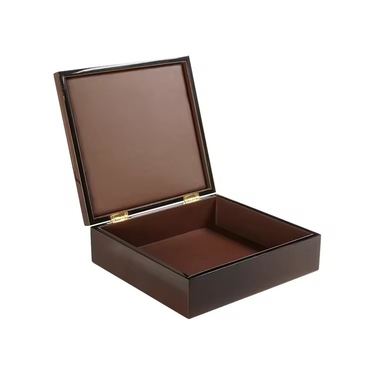
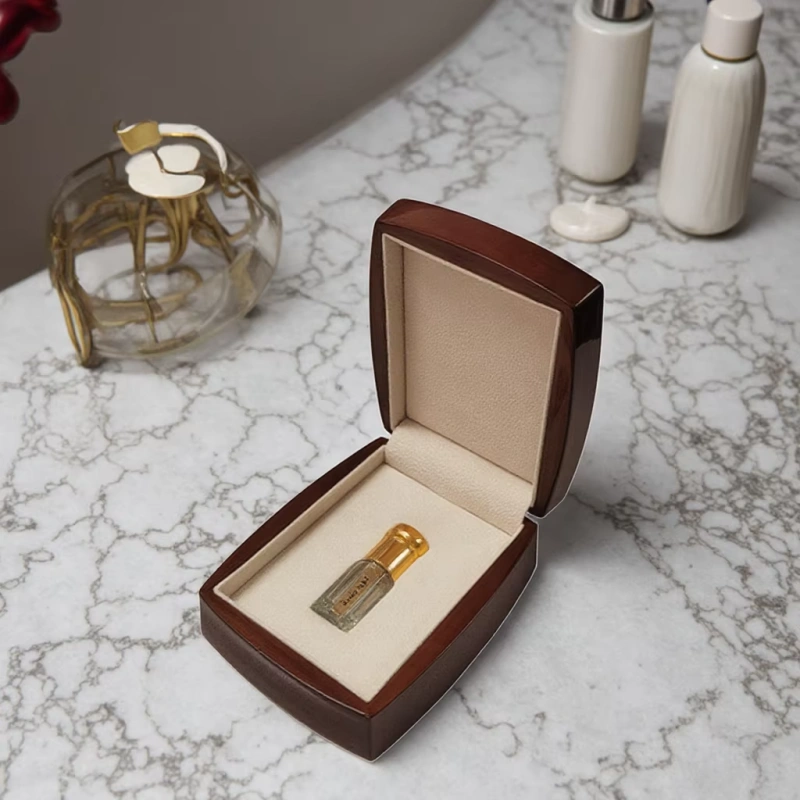
I have spent more than 15 years designing and producing high-end wooden boxes for perfume, jewelry, watches, and gifts. Over time, I learned that texture is not surface treatment. It is silent language. It tells buyers whether a brand is confident, honest, and worth trusting.
What follows is how texture works at each key psychological moment, based on real production experience and buyer feedback.
How does tactile texture shape a buyer’s first emotional reaction before visual judgment?
Buyers often feel disappointment before they understand why. That reaction usually starts in the hand, not the eyes.
Tactile texture triggers an emotional response within seconds because the brain processes touch faster than visual branding or written information.
When a buyer picks up a box, the fingers start reading surface information immediately. The skin checks temperature, resistance, friction, and consistency. This happens before the logo is read. It happens before colors are judged. It happens even before weight is fully processed.
Touch activates instinct, not analysis
Touch is linked to survival and trust. The brain treats it as high priority input. In packaging, this creates a shortcut judgment.
If the surface feels controlled and intentional, the buyer relaxes.
If the surface feels slippery, hollow, or uneven, the buyer becomes cautious.
I have seen this many times during client sampling sessions. Two boxes can look almost identical on the table. Once picked up, buyers react very differently.
Early emotional signals sent by texture
Here is how buyers often translate texture into emotion:
| Texture Feeling | Buyer Emotional Response |
|---|---|
| Soft matte resistance | Calm, confidence |
| Subtle wood grain | Warmth, authenticity |
| Cold glossy surface | Distance, suspicion |
| Uneven sanding | Cheap, rushed |
These reactions happen without words. Buyers rarely say “the texture feels wrong.” Instead, they say things like “something feels off” or “it doesn’t feel premium enough.”
Why this moment matters so much
In luxury, first emotion sets the ceiling for perception. Once doubt appears, everything else must work harder. Even a great fragrance struggles to recover from a bad first touch.
That is why I always say texture is the opening sentence of the brand story. If that sentence is weak, the reader never fully trusts the book.
Why do natural and matte textures feel more luxurious than glossy or overly smooth ones?
Many brands assume shine equals luxury. In reality, shine often signals mass production.
Natural and matte textures feel more luxurious because they reduce visual noise, increase tactile control, and align with human expectations of real materials.
Over the years, I have tested countless finishes. Piano gloss, semi-gloss, open-pore matte, waxed wood, oil-treated veneer. The buyer reactions are very consistent.
Gloss creates distance
High-gloss finishes reflect light aggressively. This makes surfaces look perfect at first glance. But once touched, they often feel slippery and cold.
Buyers associate this feeling with plastic, coating thickness, and factory speed. Even when the material is real wood, gloss hides the grain and removes material honesty.
Gloss also shows fingerprints. This creates anxiety. Buyers become careful instead of comfortable.
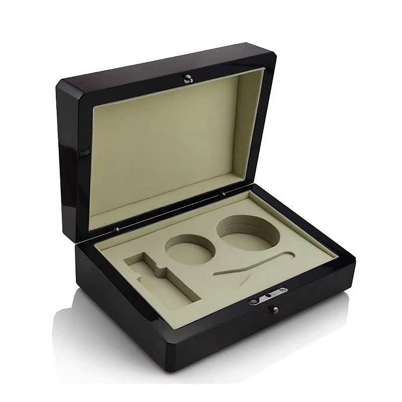
Matte creates trust
Matte finishes absorb light. This reduces distraction. The buyer focuses on form and texture instead of reflection.
A controlled matte surface creates gentle resistance under the fingers. This resistance feels deliberate. It tells the buyer the surface was designed to be touched.
From my experience, matte finishes perform best when paired with visible but restrained wood grain.
Natural texture feels honest
Wood is never perfectly uniform. Grain shifts slightly. Pores vary. Color moves gently.
Buyers understand this instinctively. These small variations signal reality.
I often explain this to clients with one sentence:
“If it looks too perfect, people assume it is fake.”
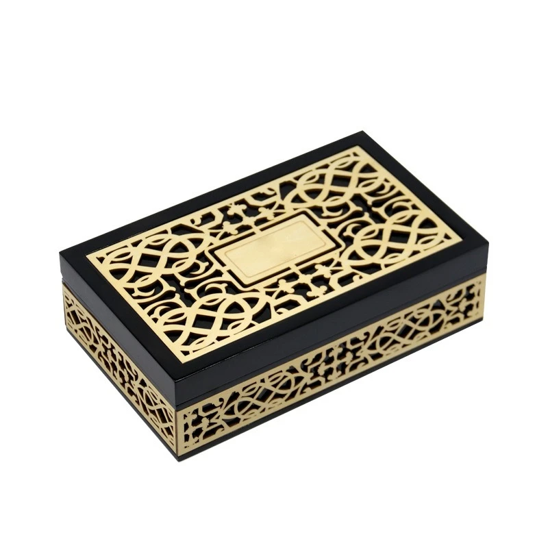
Gloss vs matte perception comparison
| Ausführung Typ | Common Buyer Association |
|---|---|
| Hochglanz | Plastic, display-only |
| Seidenmatt | Commercial, decorative |
| Soft matte | Luxury, confidence |
| Offenporiges Holz | Craft, honesty |
Luxury today is not about perfection. It is about control without hiding reality. Natural and matte textures communicate that control clearly.
How does texture subconsciously signal craftsmanship and material honesty?
Craftsmanship is rarely seen directly. It is felt through consistency.
Texture signals craftsmanship because the human hand can detect control, precision, and care long before the mind identifies technical details.
Buyers may not know how a box is made, but they know when something feels well made.
Consistency is the key signal
Craftsmanship is not about complexity. It is about repeatability.
When a surface feels the same across every panel, the buyer senses process discipline. When edges feel clean, the buyer senses skilled labor. When material transitions feel smooth, the buyer senses planning.
These signals are transmitted entirely through texture.
Texture exposes shortcuts
Poor craftsmanship hides poorly under touch.
Common texture mistakes I see:
- Over-sanding that removes grain character
- Under-sanding that leaves rough patches
- Uneven coating thickness
- Sharp edges disguised visually but felt immediately
Buyers may not say anything, but their trust drops instantly.
Material honesty matters
Texture also tells buyers whether materials are real or simulated.
Real wood feels warm. Veneer over MDF still feels honest if treated correctly. Fake wood textures feel printed and flat.
I have had buyers tell me they trusted a brand more simply because the box “felt like real material.”
Texture cues buyers use subconsciously
| Texture Detail | What Buyers Assume |
|---|---|
| Clean edge break | Skilled workmanship |
| Even grain feel | Real wood selection |
| Stable surface | Proper curing |
| Sanfter Widerstand | Controlled finishing |
Craftsmanship is not something you explain. Texture explains it for you.
Why can poor or inconsistent texture immediately break a luxury impression?
Luxury perception is fragile. Texture inconsistency breaks it faster than any visual flaw.
Poor texture destroys luxury perception because it signals shortcuts, cost pressure, and lack of respect for the buyer.
I have seen beautiful boxes rejected for one reason: they felt wrong.
Inconsistency creates suspicion
Luxury buyers assume alignment across details. If texture changes unexpectedly, they assume something was compromised.
Examples include:
- Smooth lid but rough base
- Slippery exterior with dry interior
- Sharp corners on an otherwise soft surface
Each mismatch raises a silent question:
“What else did they cut corners on?”
Touch cannot be ignored
Visual flaws can be forgiven. Touch flaws cannot.
Buyers may ignore a tiny color shift. They will not ignore a rough edge under the thumb.
This is why texture quality control is stricter than visual inspection in my factory.
Cost-saving textures backfire
Many brands choose cheaper coatings or faster processes. The result is often a surface that looks fine but feels wrong.
This creates a dangerous mismatch. The buyer expects luxury. The hand reports mass production.
Common texture failures and consequences
| Texture Issue | Buyer Reaction |
|---|---|
| Sticky coating | Cheap, rushed |
| Powdery matte | Low durability |
| Uneven grain fill | Poor control |
| Cold plastic feel | Fake luxury |
Once trust breaks, recovery is almost impossible. The product inside inherits the doubt.
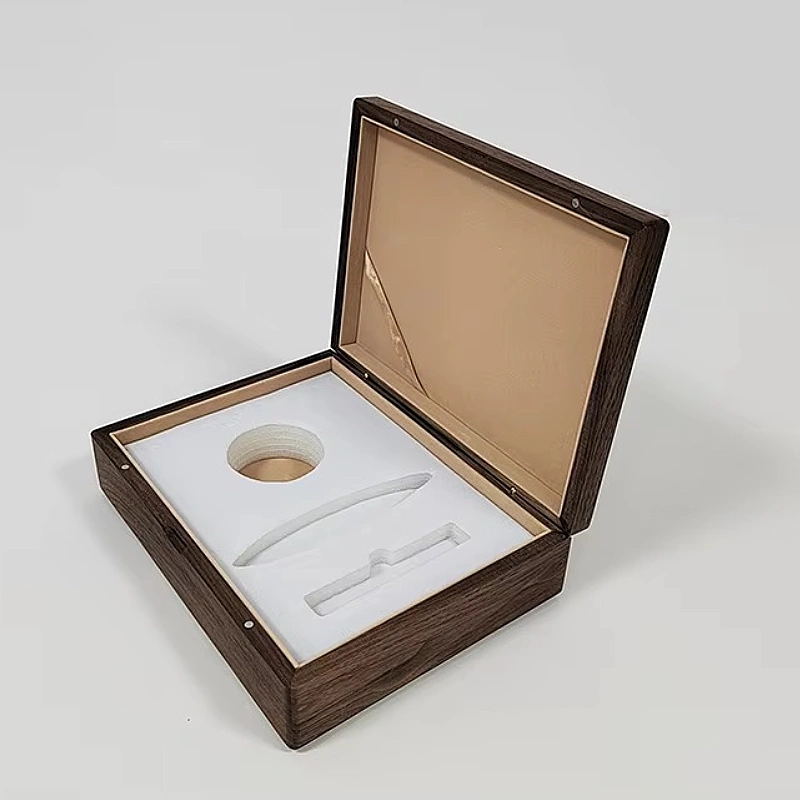
Texture alone cannot carry luxury. It must work with mass and structure.
Texture reinforces premium value when it aligns with weight and structural solidity, creating a unified sensory message of intention and care.
Luxury is multi-sensory. The brain checks if signals agree.
Weight confirms texture promises
If a box feels rich but weighs nothing, the illusion collapses.
If a box has real weight but poor texture, the experience feels unfinished.
When texture and weight align, the buyer feels grounded confidence.
Structure supports touch
A rigid structure prevents flexing. Flexing breaks trust.
When a textured surface sits on a solid structure, the hand senses stability. This tells the buyer the brand invested beyond appearance.
The combined message
Here is how buyers interpret aligned signals:
| Signal Combination | Buyer Conclusion |
|---|---|
| Matte texture + solid weight | Serious luxury |
| Natural grain + rigid walls | Honest value |
| Soft touch + clean closure | Thoughtful design |
| Heavy feel + poor texture | Confused brand |
Psychological transfer to the product
When packaging feels intentional, buyers assume the same care inside.
This transfer happens automatically. Buyers rarely question it.
I have seen perfume brands increase perceived price simply by improving box texture and structure. The fragrance stayed the same. The belief changed.
Texture, weight, and structure speak together. When they agree, luxury feels natural.
Schlussfolgerung
Texture shapes belief before sight or logic. When touch feels honest, controlled, and consistent, buyers trust the brand and accept its value without resistance.
Markenname: WoodoBox
Slogan: Maßgefertigte Holzkisten, handwerklich perfekt gefertigt